Suddenly, the animation is transformed into a live action scene. The rabbit slowly is pulled from a magicians hat, terrified non the less of the sudden appearance of fleshy humans. I love this film, the twists and turns as far as storytelling and themes go are incredible and work so well together.
Showing posts with label Identify. Show all posts
Showing posts with label Identify. Show all posts
Saturday, 8 November 2014
Out Of A Forest // Tobias Gundorff Boesen
Suddenly, the animation is transformed into a live action scene. The rabbit slowly is pulled from a magicians hat, terrified non the less of the sudden appearance of fleshy humans. I love this film, the twists and turns as far as storytelling and themes go are incredible and work so well together.
EverGreen By Yoann Lemoine // Animated MusicVideo
Inspiration// Gravity Falls
The show revolves around a set of twins, who visit their uncle over the summer who takes residence in 'Gravity Falls'. Everything seems normal, sure they're uncle is alittle weird but whos uncle isn't alittle insane? But slowly, things start getting weirder and weirder. Monsters start popping up. Strange symbols and this strange satanic like book... wow. Seriously, when I sat down to watch this show I never expected it to play out like this. The storytelling is wonderful, the 'traditional Disney style' (both in art and storytelling) is near non-existent and has instead been replaced with a modern fresh appearance that is a treat for the eyes.
John Lewis Chrismas Advert 2013
It's that time of year again. That time of year when all of tv adverts are plagued by over weight men in red suits and sad soppy snow scenes. But who could forget this incredible advert, that we had the blessing to grace out screens in winter 2013?
This animation is stop motion, not a mixture of 2D animation and 3D/Live action like most think. True, each character was animated traditionally with CEL animation. However every frame was printed then cut out of wood, placed into the frame then used more like a puppet of stop motion then a drawing. Incredible to say the least. Disney animators were brought in for the task, to complete this magnificent project. And I'm sorry cute little lovesick penguin advert of 2014, but this has to be my most beloved Christmas Advert of ALL TIME. I adore the layout, the art style, the way the shots seem to blend into each other so naturally. It's just so gorgeous to watch... treat yourself, click play.
Vocaloid // Animated Band?
Vocaloid is a computer software device that manipulates sound into certain 'characters', along with representing the voice with cute anime characters. In japan and around the world; Vocaloid is extremely popular. With it's characteristic deep story telling songs and of course, its adorable characters. Most animated music videos are fan made and considering their fandom is ginormous , there are ALOT of animations involving these characters out there (floating around online mostly).
However, Vocaloid doesn't just exist across the online realm. Oh no, these characters have jumped across the 4th wall right into the 'live consort' category of music...
Animiku is a 'live concert' animation software, which brings the characters of vocaloid to life. This is simply 3D modelling at it's finest, crafting virtual characters and brining them into the real world is wonderful. I wouldn't mind going to see it live to be honest.
However, Vocaloid doesn't just exist across the online realm. Oh no, these characters have jumped across the 4th wall right into the 'live consort' category of music...
David O'Reilly // THE EXTERNAL WORLD
Gorillaz // Animated Band?
 The 'Gorillaz' are a virtual band, whose members are 100% animated. And not at all part of our 'reality'. Designed by my lord and saviour Jamie Hewlett. The band came into existence when Blurs Damon Albarn and Jamie moved into a flat together and not soon after the band was conceived...
Animated music videos feature the 2D characters, mixing both live action with their animated forms. However at 'live' concerts the character appear on screens, giving the false reality of their existence. Temperedly of course, till someone pulls the plug.
'DO YA THING' MUSIC VIDEO
This video is a mixture of live action and animated characters; Filmed first with figures dressed up in 'green screen suits' and then animated across the top of. The video was inspired first by the music, not the music was inspired by the story like most gorillaz music videos. Telling the story of the character of '2D' waking up in the morning and experiencing what looks like an average morning in the house he shares with other members and characters.
I really like this music video, being a fan of Gorillaz already and all. However, seeing the characters act out a 'normal' story rather then something so outrageous only animation could bring it to life... was so wonderful to see. I hope they do more 'everyday' videos in the future, really mixing the characters in situations that the average fan existences is so refreshing.
StoryBoard Artist// Haylee Herrick
 Haylee Herrick is a storyboard artist and designer for the 'The Groon' movie, a kickstarter animation movie that was successful in it's goal and is currently in development.
 Haylee her a certain style that seems to capture the imagination and blends perfectly with any story or character. Her character designs adapt this style in any way imaginable to represent the characters persona and characterises in her own unique way.

Her storyboards are very 'slow moving', clearing depicting the messages and movement she is trying to express within her work as a storyboard artist. It's clear she puts so much effort into her frames, so much so they also resemble the illustrations of a comic on their own. Let alone being 'rough' storyboard frames.

Inspirational Artist // Jennifer Hager
The Show reel contains a collection of animation she produced within her 4 year studies at CalArts. I'm totally blown away at what this animator achieved and created. Not only the stories, but the style and how her work lives on paper. I especially like the sequence where the child character is fleeing from the monster, then leaps off of the cliff onto into her friends 'wings'. I really wish I could stumble across more of this artists work in the future... she's such a huge idol to me.
Inspirational Artist // The Happiest Monster - Jonathan Kim
The story focuses on a young girl befriended a happy monster, which she suddenly meets one day... the ending is personally my favourite part.
This animation short is very well animated, despite there being clear areas that are left 'unfinished'. The movement between frames flows so well when paired the story, keeping the viewers attention easily. With it's mixture of wide beautiful scene shots to dramatic tall looming shots; it really keeps the eye moving all over the screen. It also contains many 'animation rules' such as squash and stretch and of course anticipation. There is a clear style when viewing this animation short, unique qualities to the artists own imagination; from landscapes to expressions and even lighting. The textures crosshatched onto the frames really give the animation a warm almost 'touchable' feel and really brings the characters into a 3D life on paper. Of course, considering this was animated near 9years ago the artist of course animated this with CEL animation down onto paper. But I really like that, in fact I love it. Being a fan of traditional pencil animation, I'm a sucker for 'hand drawn' processes within this art form.
Pose to Pose Animation - Inbetween Animation
Pose to pose animation is a term used within animation to describe key points within an animated sequence; Where 'important' elements to the frame/scene are carefully planned out then drawn. Pose to pose is generally used within traditional animation methods, however the term 'Inverse Kinematics' is used to describe the same term within 3D animation.

Inbetween animation is used next to 'fill' in the basic animation frames to produce a more smooth crisp animation. Most inbetween animation is basic movements, like lifting a knee slightly when taking a step or the movement of the characters clothing whilst on the move. This job is often left over to a large animation team, rather then a key animator who works on key frames.
Friday, 7 November 2014
StoryBoard Artist// Production I.G
 |
| Inbetween Animators At Work |
The storyboards the studio produces are incredible to say the least. Full of character and personality that is unique to the studio and the themes associated with it's artists.
 Here are some examples of storyboards the studio produced for the animation...
I love how the storyboards translate to the final animation. Even the style, even the colours and even the emotion. I also love how the style isn't translated at all between the storyboard and the final frame; in fact it's more or less perfectly reproduced. The art director for this production was inspired by traditional Japanese wall scrolls, which is clear when comparing the old school Japanese style to the style of the storyboards and animation.
Octocat adventures/// David OReilly
David OReilly is an artist who is responsible for a list of crudey animated shorts.
However, 'Octocat Adventures' can be classed as a calibration between a 9 year old boy from Chicago and the artist himself. The original animation (sent to David) was hand drawn and animated by the child on MSPaint, compleat with high pitched childish voice. He then adapted the series in the style of the 9 year olds to produce a short film about Octocat... But 20seconds into the final episode of the red cat with eight legs adventures the animation takes a dramatic twist. The animation switches; the 2D style is filled to an incredible 3D style and well textured. He really brings the 9 year olds animated series to life, in his own unique style.
The colour pallet of the whole short is painful to eye, but in the best ways. And that's why i approve of all of this.
Wednesday, 5 November 2014
Storyboard Artist// Sam Hood

 His style when producing storyboards is very loose and simple, using colour effectively to identify characters and lighting and also detail. In many frames backgrounds that have already been roughed up are added to his storyboards to really give that extra effect to each frame.
 Also working as an animator within the Pixar, Disney and even dreamwork studios; there isn't much this artist hasn't given ago at when it comes to creating.
Storyboards// Puella Magi Madoka Magica
 '' Puella Magi Madoka Magica '' is a Japanese animated series which is loosely classed as a 'magical girl anime'; However is nothing like any of it's idols. This series is twisted, bloody and strange on a whole new level - It also happens to be my favourite when it comes to Japanese anime.
 When researching for Japanese storyboards I noticed that the frames were laid out differently then what I had been taught to do and how western studios produce storyboards; then again, considering there is no right or wrong way to lay out storyboards this isn't really such a big deal. Just. Different as far as presentation goes, I guess.
 I found a few storyboard pages online, which were pretty hard to track down. I was unable to find the artist behind these frames, which was very disappointing. Of course, I can't read Japanese so I have no idea of what any of the noting reads as. However, it seems to be one column describes how the frame should be presented for example what angle or timing and the other may refer to the scripts narrations. One of them could in fact reference details within each frames that shouldn't be left out.
Each frame is drawn by hand, simply drawn and could even be classed as a 'quick sketch'. However the artist has portrayed each frame in a way that clearly displays detail and characters, in their simplest forms. The artist has also included arrows, to reference movement or gestures.

Above is a page of references for an episode. This contains certain elements like backgrounds and layouts that are needed for final conclusion or for understanding of the frame. Layout work for backgrounds is in some ways, far more important then 'character gestures'. Because the background must be clearly laid out and scripted for the scene to play within it.

Finally, here are a few original key frame shots for an episode. Key frames are more to do with the 'focus' of a scene, rather then 'fill in' animation. These can also be classed as storyboards (in my opinion) because they communicate within one image what is happening, in order for other artists to fill in the blanks or complete the frame.
12 Basic Principles Of Animation
Squash and stretch
Classed as 'the most important principle' of animation, this rule covers the belief that weight and flexibility should be 'enhanced' within animation. For instance when a ball bounces, in reality the physical mass of the ball doesn't shift and it remains the same shape. However, when animating a ball you should 'squash and stretch' it; this gives the illusion of 'bouncing' by drawing the ball slightly squished against the mass it's hitting. This rule can also cover a range of animation, such as a character looking shocked; their eyes may open dramatically and even change shape for a frame or two. This enhances the over all emotional reaction and gives the appearance of a much more smoother/faster movement.
Anticipation
Anticipation can also be classed as a 'pause'. It gives the audience the time to resistor what's about to happen or how that character may even react; It also makes the animation appear more realistic.
Staging
Staging, is when you frame a scene in such a way to highlight the elements within that shot to the audience. For instance, if there was a scene within an animation of a city and you wanted your audience to notice a certain character clearly; You'd place that character in a noticeable place. Rather then clustered together with background characters (unless that's the purpose for the scene).
Straight Ahead Action and Pose to Pose
Straight ahead means to draw a scene out frame by frame, from beginning to end. However, Pose to pose is when a scene is covered first with 'important' frames then filled in later. Straight ahead gives a more fluid and often fast vibe to the audience. But pose to pose works much better for dramatic or emotional scenes.
Follow Through and Overlapping Action
This rule covers the ideals of making something look physical possible or realistic. Follow through covers the idea that loosely tied parts of a body should continue moving after main mass of that body has stopped; for example if a character stops suddenly that characters hair or clothes will continue moving forward for another few frames, then move back into place. Overlapping is the 'law' that different parts of the body move at different rates, if a character turns suddenly they may turn their head faster then turning their body. 'Drag' is also important here, where heavier parts of the body move slower and almost harder then lighter parts.
Slow In and Slow Out
Animation looks more realistic when the beginning/ending of the animation contain more frames; for instance when a character begins to walk, that character must first get into the 'sway' of movement.
Arc
Realistic movement both in animation and the real world around us, covers the theory of 'Arc'. This theory implies most movement is based on a arc or swing. When a character walks, that characters head doesn't remain in line with past frames; it arcs slightly up and down, with each step.
Secondary Action
Secondary actions is when a primary action is followed up with a second that emphasizes the first. If a character suddenly stops, then looks shocked. Looking shocked is the secondary actions. It supports the reason that character stopped suddenly in the first place; it emphasizes and gives the animation 'reason'.
Timing
Timing is very important within animation, however is sort of backwards. When an action is seen as fast, it contains less frames then a slow action. This lack of or extra frames gives the illusion of realistic timing.
Exaggeration
As defined by Disney, Exaggeration is ''to remain true to reality, just presenting it in a wilder, more extreme form.'' For instance, a cartoon horse may stand on its hind legs within a cartoon; which is impossible for a real horse. However, the bone structure of that cartoon horse is still realistic compared to a real horse. They exaggerate the capabilities of the cartoon horse.
Solid drawing
This means to give an object weight and mass, to claim a three-dimensional space. This also covers the ideals of lighting and anatomy.
Appeal
This is the ideal that every character must be appealing on one level or another, be that character 'good', 'evil' or just a background character. Something must attract the viewer to the character, to imply that characters 'realism'.
Inspiration - Bee And Puppycat (Natasha Allegri)
Bee and Puppycat is a soon to be series created and written by the wonderful Natasha Allegri.

Originally premiering online as a two part episode in 2013, the pilot was so popular 9 more episodes were near instantly scheduled for 2014; following an extremely popular reaction to a 'kickstarter' to support the show. (Basically asking viewers online to donate so the show could continue) A huge $872,133 was raised for the show by fans, speeding past the original goal of $600,00. Cartoon Hangover began work on the show and are hoping to release more episodes by fall 2014.
The original concept for this cartoon was to base it on the 'magical girl' theme. A theme popular with manga and anime, aimed at women. And of course, looking back at the pilot for the show; its pretty clear Natasha is heavy influenced by that theme. The over all style of the cartoon is adorable. The use of soft colours and lines are really refreshing, a real treat for the eyes. Much like adventure time this cartoon is stylised in its own unique way, following in the footsteps of Cartoon Hangovers first show 'Bravest warriors'.
Natasha Allegri is perhaps best known for her work on Adventure Time, being the original designer for the gender-bend versions of the characters from the show and working as a storyboard artist. She also illustrated and wrote the popular 'Fionna and Cake' Adventure Time comic books, which are still continuing. However is currently working on her own creation, Bee And Puppycat; working within the studio Cartoon Hangover.
I really love this show, being a fan of the 'magical girl' theme already. I find the cartoons just so refreshing to watch, from the pastel soft colours and shapes to the voice acting and characters themselves. I can't get enough of the overall heartbeat of this show and I've only just discovered it. The more I study Natasha Allegri and the more I admire her work; the MORE I feel so inspired to create something similar. I can't wait for the studio to release more episodes in the future and hopefully this wonderful piece of eye candy won't be cancelled!
Originally premiering online as a two part episode in 2013, the pilot was so popular 9 more episodes were near instantly scheduled for 2014; following an extremely popular reaction to a 'kickstarter' to support the show. (Basically asking viewers online to donate so the show could continue) A huge $872,133 was raised for the show by fans, speeding past the original goal of $600,00. Cartoon Hangover began work on the show and are hoping to release more episodes by fall 2014.
The original concept for this cartoon was to base it on the 'magical girl' theme. A theme popular with manga and anime, aimed at women. And of course, looking back at the pilot for the show; its pretty clear Natasha is heavy influenced by that theme. The over all style of the cartoon is adorable. The use of soft colours and lines are really refreshing, a real treat for the eyes. Much like adventure time this cartoon is stylised in its own unique way, following in the footsteps of Cartoon Hangovers first show 'Bravest warriors'.
 |
| Adventure time Concept Work By N.A |
I really love this show, being a fan of the 'magical girl' theme already. I find the cartoons just so refreshing to watch, from the pastel soft colours and shapes to the voice acting and characters themselves. I can't get enough of the overall heartbeat of this show and I've only just discovered it. The more I study Natasha Allegri and the more I admire her work; the MORE I feel so inspired to create something similar. I can't wait for the studio to release more episodes in the future and hopefully this wonderful piece of eye candy won't be cancelled!
 |
| Lovely Concept Art |
Inspiration - Chris Sanders

STORY BOARD ARTIST...
Working on a number of films as a storyboard artist, his unique style helps communicate extremely well when drawing movement and gestures.
It's clear that when he illustrates a scene with his storyboards, a certain personal charm comes across; his drawings are so simple and yet so detailed down to the finest point. Highlighting what he wants to communicate in that scene to others; Depicting emotion perfectly/what the character is possibly thinking and expressing movement.


WRITER...
Chris sanders pitched 'Lilo And Stitch' to Disney in 1998, with an illustrated pitch booklet of the original concept of the story. Only 4 years in the developmental stage, he adapted his character designs and over all story so much for Disneys target audience;its oddly strange and yet interesting how much the film moved away from its original booklet form and yet some elements from the story are so clear in the film. 

Chris Sanders has had such a drastic impact on my own work and my attitude towards storytelling in general, since I discovered him a few years back. In fact he's one of the few artists which I idolise, I could even go as far to say he's the reason I want to become an animator some day (or something similar). I can't possibly describe how much I adore how he depicts the female body and expression. The flow of line within his illustrations are so lovely and full of charm, along with the soft smooth colours he uses and the over all humour. Of course, he's most famous as an illustrator for these pin up girls I adore, which are amazing and hopefully I will have the honour of spending WAY over a 'students budget' on one of his pieces or even sketchbooks. 
Seriously, I'd trade my useless(don't need it to draw) left hand to simply meet the guy.
Monday, 3 November 2014
Storyboard Artists// Joe Ranft
 Joe Ranft was an American born artist who worked within the Pixar and Disney studios. He worked as a storyboard artist on a range of animated features; such as the nightmare before Christmas and James and the giant peach. He was also the mastermind behind the Pixar film 'cars' but sadly passed away before the film was completed.
  His work within the Pixar studies on 'A bug's life' and 'Toy Story' was a clear benefit. His comical way of solving problems and portraying ideas and stories was described had a constant presence within the films he was involved in. In fact he was so well known within the animation community and creative; that after his death in 2006, Laika gave tribute to Joe in the form of a character, which was featured within stop-motion film 'Coraline'.
Storyboarding//
 Gratifying towards watercolours and coloured pencils rather then charcoal and simple pen; his cartoony style is always so clear within this storyboards. I love how much expression and character he captures within such simple sketches. Along with the colour pallets he lays down onto paper. Joe also worked as a concept artist and story supervisor/writer. So was often responsible for early layout work and testing frames.
 I especially love how he expresses gestures and movement with his storyboards, along with clearly displaying the important elements to the frame he wants to get across with each.
 Joe is seen as one of the first 'founders' of the Pixar studios, originally involved in the Disney animation studios and then moving of course. His influence is clear in all Pixar movies up until his own creation and final creation 'Cars'.
Friday, 31 October 2014
Adobe Illustrator // Pen tool

Here are my results when experimenting with the 'pen tool' within the software of 'Illustrator'. I've only really played around with the software before, doodling and scribbling the odd thing; but never learnt all the tips and tricks to the software itself.
We tested out the tool first on a sort of 'colouring in' paper, a helpful guide to teach us the basics about using the tool. The first few I didn't find too hard to complete. However, the last few I really struggled with; to the point I needed to beg my 'godlike' boyfriend for help.
 At first I found the tool extremely confusing and it came across as 'too complicated' to really bother putting up to get the end result; which could of been done easier, quicker (in my option) in photoshop or something similar. But I understand why people use this software.
This software produces work not as a cluster of pixels but as vector. Which means you can resize, stretch and position the image without much trouble or danger of getting that horrible glitchy look.
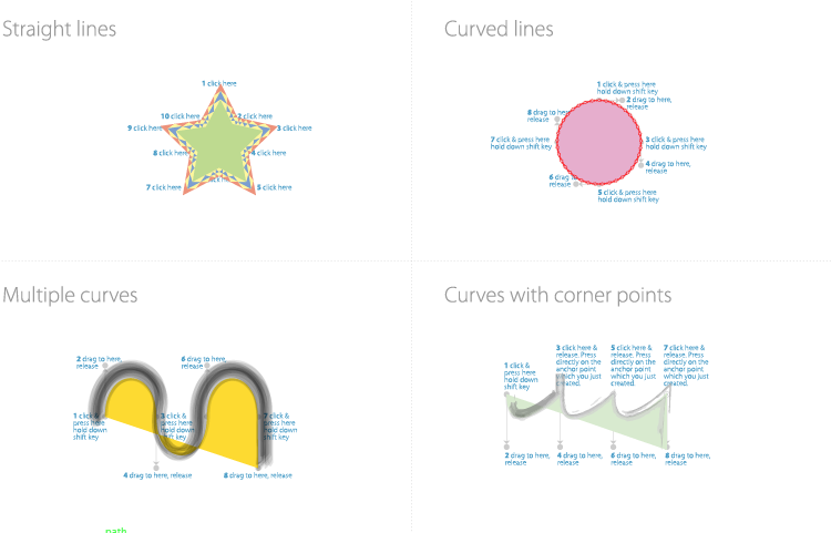 You can also add a lot to this tool, like playing around with the lines. Making them thicker or thinner, or even adding some soft of texture to them. You're also able to mess around with the 'inside' colour and manipulate the original shape or object any way you please.
Over all, it was useless to be introduced to this tool and software. Even if I'll instantly go back to photoshop if I ever want to play around with computer animation or illustrations; it's nice to know there's another option out there.
At first I found the tool extremely confusing and it came across as 'too complicated' to really bother putting up to get the end result; which could of been done easier, quicker (in my option) in photoshop or something similar. But I understand why people use this software.This software produces work not as a cluster of pixels but as vector. Which means you can resize, stretch and position the image without much trouble or danger of getting that horrible glitchy look.
You can also add a lot to this tool, like playing around with the lines. Making them thicker or thinner, or even adding some soft of texture to them. You're also able to mess around with the 'inside' colour and manipulate the original shape or object any way you please.Over all, it was useless to be introduced to this tool and software. Even if I'll instantly go back to photoshop if I ever want to play around with computer animation or illustrations; it's nice to know there's another option out there.
Subscribe to:
Posts (Atom)