Saturday, 17 September 2016
Sunday, 8 May 2016
Documentary Animation// Evaluation
Documentary animation hasn't been an area of animation I have ever considered to venture into as a an area of personal interest perviously, however for this module I was tasked with the challenge to select an over all theme in order to produce that theme within a documentary format with animation; the theme I choice was 'Family'. I worked with Malachi Lawrence who was responsible for the environmental design and background work and James Beardsell who was responsible for editing, directing and also animated on the project. Originally I was attracted to working with James because his idea of documenting his experiences with the death of his father I found very touching and honest; knowing James for quite a while now, I wanted to help him create such a piece to remember his father by. We were inspired by simplistic animations with honest reflective interviews to create our animation as well as naive artists such as José Rodríguez Fuster and ivan generalic.
For this project I worked as a concept artist, character designer, visual script writer, colour director and animator. Originally our group was only going to animate James own experiences with losing his father to cancer, however after being suggested by tutors to add another voice to our documentary I gave my own experiences to the project. At the time I was discovering elements of my parents divorce that I wasn’t aware of and as a result, I began feeling uncomfortable working within the project however continued with the idea. I also was given more roles within the project then originally agreed, as my concepts for our animation were preferred over Malachis character designs by our director James. When working on the animating aspects of this project I struggled to maintain the work schedule set, I wasn’t told if backgrounds were completed in order for me to start animating the scene with correctly placed and sized characters or that they were even available to me. I also struggled when referring to the animatic, because James didn’t adapt the animatic to our second recording of narrative and as a result the animatic didn’t follow the narrative particularly well at times.
The final animation, as well as the final version of our narrative, was edited together by James, who also added subtitles to our animation. We kept in contact with content with a google Drive, where I’d upload the finish animation scenes in order for James to then segment them with his own animated scenes. I also created an animation tutorial for James, when using the textured brush neither of us had used before. When animating to the animatic I struggled, as the narrative did not match up with the shots and much of the segments of my narrative were accompanied with a blank screen. I also had to create my own backgrounds for certain scenes at the last minute because neither James or Malachi informed me that the backgrounds were complete. I’m not very happy with the final animation, however I do like how our unique approaches to art have blended semi-together. The visual storytelling within the scenes I animated I feel I created and expanded from the animatic I was given to the biggest of my capabilities as an animator in the project. Looking back at the project, I would of liked the animatic and storyboard to me more informative to animators than it was. I feel like the communication within the group, considering we have both a digital folder for everyones work and several online chats, was poor and as a result the final animation looks sloppy. In my opinion. I did enjoy working with Malachi as his illustrations are very refined and his visual concepts are something entirely new to my own creative tastes. As a director I feel like James worked more as an editor and animator than what a directors aim is within a project and the title of director was shared with the three of us creatively. I haven’t enjoyed working within a group on this project because the tasks I were asked to complete were always very vague, which gave me a lot of creative freedom but felt more like I was working independently then on a group project.
I'm personally very pleased with the character designs I developed for this project, from concept art to final character design sheets. My idea to represent our narratives with animals, based on the themes presented to us within our interviews such as descriptions and environments I’m over all pleased with and feel like they work much better then any humanoid characters I could of designed. I’ve animated in a similar way to this project perviously, last year on a project. Where I animated with segments of colour rather than flat outlines. Strangely, although I find the method stressful and time consuming I do really enjoy this animation method of animating colour and shape, rather than line. As a result, I’m also interested to use more textured brushes in to come animation projects, like the animations I produced in this project rather then clean and bold outlines that seem to me as being very ‘traditional’. I’ll return to the animation I've created for this project and finish my own backgrounds for each segment; so I can use the clips I want for my showreel for this year, as I did for a few segments of animation in the final cut of the animation.
Documentary Animation// DVD case
I was given a DVD case design by James Beardsell, our director and editor and found that he'd misspelt several things, including my own name. When I asked him to edited it, he refused, So I've designed a more simplistic cover for my own submission. I wanted the case to be simplistic and clear, and at the same time document the characters involved. Both fathers with their child and then their fathers absence. I also included a short definition of the documentary, as well as a quote.


Saturday, 7 May 2016
Documentary Animation// The finished animation
After uploading my animation files to our shared Drive for this project, the editor for this project James segmented our final scenes into the finished film file along with subtitles. At one of our presentations for the project, it was suggested to James that he add subtitles to our animation by one of our tutors because our interviews weren't as well spoken as we would of liked, partly because the recording sessions was very emotional and sensitive for both me and James.
Below is a video link to the version of our final animation that I uploaded to my youtube:
Below is a video link to the version of our final animation that I uploaded to my youtube:
Documentary Animation// Finishing off the last few scenes
 Currently I'm animating the final scenes for this project. One of which involves the most character animation, as two characters interact together on screen.
 Here are two scene shots from the process I've been using to animate. I've been using Photoshops timeline function in order to create animation at 24fps, with frames that last 2frames each (to give it a 'messy' crayon like appearance) and I often use several layers for each over all frame as a sort of 'build up' image. Normally I use the middle frame to define the silhouette of the characters, then the top frame to draw on the white features that define the segments of the characters and finally the lower layer is filler, to give the silhouette body.
Thursday, 28 April 2016
Documentary Animation// Scene Layouts
Today I handed in my CoP2 work for my second year of studying within the subject and as a result I'm not free to continue working on the Dad Documentary Project. I haven't worked on the project for a few days, because I've been waiting for backgrounds so I'm a little 'out of the loop' with animating. Before are a few examples of layouts for the scenes I'll be animating that I mocked up by referencing the storyboard by Malachi, our background artist.
When I begin animating a scene I start with a very basic visual structure in order to get an idea of how the final product will look on screen. I illustrate the objects/environment loosely with red and the character placement with blue. I then begin animating the characters and I draw the environment last, or drop in the background if they've been provided for me.
As an example here's the finished animation scene for 'Scene 4.2' -
in this scene, the storyboard was poorly edited together and the timing was off; so I added an additional character in order to portray the narrative better visually.
When I begin animating a scene I start with a very basic visual structure in order to get an idea of how the final product will look on screen. I illustrate the objects/environment loosely with red and the character placement with blue. I then begin animating the characters and I draw the environment last, or drop in the background if they've been provided for me.
 |
| Scene 4.2 layout |
 |
| Scene 5 layout |
 |
| Scene 6 layout |
in this scene, the storyboard was poorly edited together and the timing was off; so I added an additional character in order to portray the narrative better visually.
 |
| WIP shot from 'DAD Documentary' |
Wednesday, 20 April 2016
Documetentary Animation// Waiting to start animating again
I've animated about 30seconds of the animation my director has given me to complete before our deadline for this animation project, which is approaching quickly; however currently I'm unable to continue animating. Our background artist Malachi hasn't completed our backgrounds yet, which I've been chasing him up about for the past three weeks or so; so I'm unable to begin animating those segments, because I'm not sure which characters need to be placed and how large/small they have to be in regards to their surroundings/environments. I'll begin drawing out the remaining segments backgrounds myself if I don't get Malachi's backgrounds by this weekend...
Wednesday, 13 April 2016
Responsive// Summative evaluation
For this module titled 'Responsive' I was tasked with applying to multiple briefs outside of university both as an individual and within a collaborative group. The aim of this module was to encourage me to put my work out into the publics eye in order to engage with the external world of following instructions within job briefs. In order to do this I applied a number of competition briefs; Loop De Loops 'Sisters' brief, Do It In Tens 'Dark' brief, OnForm weekly 'Shape' briefs, a single entry into Illustration Friday and for the collaborative brief D&ADs 'Amnesty' brief.
For Studio Brief 1 titled 'individual practise' I was expected to engage with a number of briefs by submitted personal entires responding to those set briefs. I entered 4 separate briefs, one of which involved submitting three separate pieces of work. All 4 briefs were completed within Photoshop and it's softwares timeline feature; which is an aspect of its software I'm very at home with now and feel like I have greatly improved my skills within the software. My entry for Loop De Loop's 2015 brief 'Sisters' I feel is my most successful submission within this studio brief, as I've gained the most attention from submitting this entry as an artist and am most proud of it's final outcome. I also feel I've experimented differently then I have previously done within my work within Do It In Tens 2016 brief 'Dark'. Within this submission I responded to the briefs word with my own understanding of what that word meant to me and represented for me personally. This submission is also the first segment of frame by frame animation I've animated in 24 Frames Per Second, which is something I'm keen to continue using in the future as the results of this submissions animation is far more fluid then 12 Frames Per Second; I'm also pleased with the character animation within this submission. Although I found the OnForm briefs engaging and entertaining I felt the manner in which the website page was managed wasn't very professional however I did gain some online attention as an artist from my submissions to this page, within Tumblr where the webpage was held.
For Studio Brief 2 titled 'collaborative practise' I was expected to engage with a single brief of either from the contest holders D&AD or YCN with other students from my year within Illustration and Graphic Design. We were introduced to the whole year groups of Animation, Illustration and Graphic Design within a presentation format designed by our tutor so we could be made aware of the creative students we may end up working with around us; which was very beneficial. I choice D&AD's brief for 'Amnesty' because of the political and social standing the group campaigns for that I personally believe is incredibly important and needs to be addressed more especially to people my own age and younger. I entered a collaboration group with Emily from illustration and Poppy from graphic design. Both myself and Emily developed our submission from idea, concept, design to final product without Poppys influence as we couldn't contact her or get contact from her after our first meeting where our group formed. Within this collaboration group both myself and Emily developed our idea to create animated posters for social media, where Emily would design and draw illustrations and I would then animate those illustrations into GIFs. I animated our four moving GIF posters within Photoshop at 12FPS, as I didn't want the end files to be too big and there for avoid any higher frame count. I feel like our four images, both as illustrations and moving posters respond to the brief set by Amnesty well; as they engage with young people, are eye catching and informative but without being too intimidating, which may be a common response to Amnesty considering the subjects the group deal with. Although I would of loved to have animated a full animated feature, I'm still pleased with our end submission and really enjoyed working a response to this brief with Emily.
Over all I've deeply benefited from this module as its taught me how to analysis briefs and respond to them accordingly as an animator and creative. I've gained a wider following on social media, by submitting my work to the contest briefs listed above as well as gained experience from digital software from working within Photoshop.
Tuesday, 12 April 2016
Responsive// Project Report
RESPONSIVE Project Report - Molly C Lester ML255090
Loop De Loop 2015 Brief ‘SISTERS’
Loop De Loop is a bi-monthly animation contest, where a theme will be submitted to the global public; the brief I entered was the 2015 brief ‘Sisters’. The brief outlined the concept of what being a sister was, from siblings to a deeper bond than friendship. I started the brief with vague idea of the sort of animation I wanted to produce; I wanted to make a punk fuelled sarcasm approach to cat calling and how groups of women deal with it. I was inspired by a variety of media; such as the artists Gemma Flacks illustrations, that depict a variety of women with a very heavy feminist tone. Gemma Flacks work heavily inspired me when I began designing the women featured in this animation as well as the currently trend of ‘90s fashion’. I wanted to develop this idea before I thought it was an interesting take on the term ‘sisters’ - as in a close bond between two women, that isn’t necessarily blood-relations or friends. I referenced the satirist tone found in Sun Creature Studios ‘The Reward’ series regarding how they depict flirtatious men. The animation runs for 47 seconds including one loop and was animated at 12FPS on photoshop timeline software. This was the first fully animated film that I had animated within Photoshop software, without the help of After Effects; So I developed a very quick understanding and feel like I’ve improved my skills within the software greatly. I was heavily reliant on using the positioning tool within the Photoshop software timeline, when positioning the segments of animation with one another on screen. I also used the software pre-installed on my laptop to record all the sound effects of the characters and found additional sound effects online. I uploaded the animation onto the Loop De Loop website three weeks clear of the official deadline for the brief. Overall I’m very proud of my entry for this brief and the message it portrays (despite being sarcasm). Looking back at the animation, what I would do to improve it is add more animation to the sequences and better sound quality. The characters I’ve depicted that respond to the term ‘sister’ approach the word with the understanding that being someones ‘sister’ can be something that transcends blood-related or even close friendship; But can be a joining of ideals or an approach to a situation - ‘Sisters in arms’.
OnForm Brief ‘SHAPE’
OnForm is a Tumblr based weekly contest, where a shape is submittable to the social media blogging site and artists respond to the shape by visually communicating what they seen within the shape by drawing within,atop or shaping the image. This is a globally submittal brief. With this contest I submitted work to the page 3 times, all of which were animated GIFs. The first shape I responded to quickly, animating simplistic black and white segments to depict a woman in a window, hair blowing in the breeze and tears falling; looking back at this submitting I could of improved this greatly. The second shape I added black and white segments to the image, both in the foreground and background; to shape a snail creature out of the shape OnForm submitted; Although I really liked the end result, which was an adorable Snail GIF I could of improved this entry by better looping the animation as it’s rather jarring when looped. The second shape I simplistically animating the image as a GIF because the deadline was close and looking back I really would of loved to animate this GIF further. These animated GIFs were inspired by simplistic rather graphic approach to animation. As far as responding to OnForm briefs I feel like I responded well, as non of my entires were rejected; but I could of responded better to these briefs.
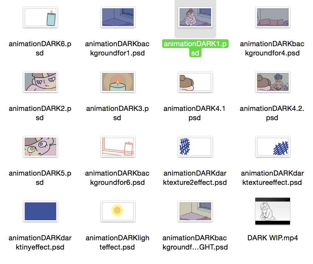
Do It In Ten Brief ‘DARK’
Do It In Ten is a 10 second themed animation contest featured on ‘show me the animation’s website. This months theme that was submitted by the site was ‘DARK’. Anyone can submit to this monthly contest, as long as the animation itself is in the time realms of 10 seconds. When approaching the brief I was struggling to sleep, I was seeing a number of mental health practitioners but nothing seemed to be benefiting me. However I managed to move past the situation and begin to recover with the help of very close friends and loved ones. I wanted to recreate this feeling within a piece of my work. I was inspired by my own understanding of what support really is, of how raw and venerable being in that place feels like and of what ‘DARK’ means to me personally. I designed the characters nude in a simplistic cartoon manner; in order to portray the feeling of venerability within these characters and understanding with each other. I struggled at first to depict the story I wanted to tell across in a natural feeling way in the time frame of 10 seconds; storyboarding the animation multiple times in different orders in hopes of fitting everything into the briefs rules. The final animation comes to 10seconds in length and is animated at 24FPS. For the audio I used James Grimshaws own recorded music, with full allowance of usage within my animation. I used the digital software photoshop to animate this, within its timeline function and layer function. I also used the same software to stitch different saved animation files together into the final 10seconds of footage. I also used the layer function within photoshop to set the lighting for this animation. For the candle animation itself I used a 50% opacity layer of yellow to suggest the colour change onto the scene from the animated flame. I did the same with the blue-ness to the animation, so it would be easier to design the colours for the characters and still give the illusion they were in the darkness. I met the deadline head on, uploading the animation itself onto the websites contest page on the day of submission deadline. Regarding the animation movement and fluidly itself in this contest entry I’m very proud; I feel like the movement depicted by both characters is one of the most smooth and fluid pieces I’ve done to date. I didn’t win the contest, despite the fact I was only one of three animators who entered that brief title. I feel like I was successful within this contest entry, as it took it to subtextual deep very personal level. Of course ‘personality’ doesn’t necessarily make the best brief entry, but it does produce an original idea.
Illustrated Friday Brief ‘TROPICAL’
Illustrated Friday is a weekly brief broadcasted by their very own website, the site has been up and running since the early 2000’s. I did plan on submitting to this contest multiple times running up to the deadline for responsive but I did forget about these briefs all together until now. The brief i entered was themed ‘TROPICAL’. I did a brief mind map of ideas and leant towards the idea of doing some sort of ‘Hawaiian themed’ pin-up, but to avoid unnecessary sexualisation I produced the illustration in an innocent cartoony visual aesthetic. I scanned a rough sketch into the digital software Photoshop and redrew the image on separate layers. I honestly feel disappointed in myself that I didn’t enter more into these sets of briefs and looking back at it, I really would of liked to get more involved within this websites contest briefs. I will most likely continue to enter these contests on and off, heading off into the end of 2016 and possibly for the rest of the websites living life.
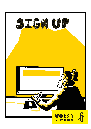
D&AD Brief ‘AMNESTY’
The D&AD Brief ‘Amnesty’ was my choice for the collaboration segment of this module. I was drawn to this brief because I was interested in producing work within a project that was in some form political. The brief itself asked for some sort of visual attraction for young people/students to get them involved in Amnestys current work, with a folder of information, colours, icons and suggested material. Originally I was part of a team of three with Emily Flanagan and Poppy Young, however after meeting once and outlining both Emily and Poppy would develop an in-depth idea of the sort of approach we’d take to this brief and I’d animate it; both myself and Emily lost contact with Poppy. Beginning developing work for this collaboration brief late with just myself and Emily now, we began quickly working out possible ideas a few weeks before deadline. Because of the lack of production time we ruled out producing an animation but rather something that was animated. Myself and Emily developed the idea of producing animated posters, both physical copies and GIF versions. For this collaboration project we thought producing media for social media impact as animated images would fit perfectly with the brief, as young people/students are very fond of social media. I also suggested we approach our response to this brief with constant understanding of whats appropriate; in order to not offend any of the sensitive material Amnesty deals with globally. We began researching into possible visual ideas, creating image boards to inspire us. I suggested we focus on the ‘positives’ of helping out Amnesty and not the issues they combat; purely because within my research, the images themselves seemed heavily intimidating and not really something a teenager would want to firstly get involved within. Emily began developing illustrations, from my vague ideas of what we should focus on which were; Meet ups, Sign ups, Get involved and Get Informed. Emily produced four traditionally drawn and inked images which she scanned onto her computer and in order for me to animate them, split segments of the images into layers. I began animating the images, within photoshops time time function; by setting position keyframes for each frame so simplistic movement was achieved in a GIF format. Deciding to leave each slogan for the last minute in hopes Poppy would appear and engage with the project, Emily ended up designing our own graphic text and inputting them onto our posters/animated posters. Our images were put together by myself on photoshop and saved as both a PNG and a GIF file (as well as rendered out as a quicktime video for referencing). I also edited the Amnesty icon onto our images and our hashtag, ‘GetAmnesty’ which I developed. The term ‘Get Amnesty’ refuses to getting to know Amnesty and ties in with the over all verbal theme of our four pieces. The slideshow which was requested by Amnesty for this brief was something I also put together, outlining out basic idea for our response to their brief. Myself and Emily submitted our collaboration project as a join team, leaving Poppy out of the credit because she didn’t add anything or do anything for this project. Looking back over the response our collaboration group did to the Amnesty brief, hosted by D&AD; I feel like it’s a very appropriate and successful. Having both physical poster and animated versions of our images is a huge unique benefit our collaboration group has. By producing a response designed for having a visual impact on social media we’ve responded to the request from Amnesty within their brief to attract the attention of young people and students; as research our collaboration group developed confirmed social media is the new market place for information for this age group. To improve this submission I would of loved to animate our images further and into more detail.


Resposive Group Work// A2 development boards
Below are the development boards I'm presenting for the group project for the responsive brief;


Thursday, 7 April 2016
Responsive Group Work// Submitting
Meeting the deadline myself and Emily submitted our joint project together on the briefs website by uploading both GIFF versions and PNG versions of our four images. We're also expected to supply them with physical work, which will involve;
- Drawings, sketches and concepts of our submitions
- Screens shots of where/how the GIFs of our four images can be used on social media and under the Hashtag we created
- Any addisonal research boards/wordings
Responsive// what's the problem part 2
I've chosen the YCN 2014/15 Student competition brief 'GAP' to discuss in this blog post.
In this brief the GAP clothing company is advertising for some sort of brand campaign that reaches out to students and attracts them to the brand. Entering the brief GAP defines itself and its own company with that they are/what they want. The brief then goes on to inform the reader that GAP is kicking off it's new campaign 'dress normal' since joining together with another company, the advertising agency ' Wieden + Kennedy '. After that, it discusses what it wants from the entry; the brief wants readers to produce some sort of work to help support their latest campaign - targeted at the 'student population' - they also mention this campaign is ready to drop in freshers week 2015, in order to attract most attention from the student population. Inspiration is also provided, using it's already existing presence within high street fashion as enough inspiration for the reader; hinting to keep the entry within the realms of what GAP already produces. The brief also mentions that this entry will be used globally and to take that into consideration when producing work, despite the fact this entry will be for the UK.
The brief (like many/most briefs) also defines what is needed in the entry to be considered;
''Message must incorporate a 25% off promotion exclusive to students during fresher’s week.
Must use the Gap logo – cannot be changed or altered.
Inject Gap tone of voice – see Dress Normal campaign reference (additional tone of voice guidance can be requested by email).
You must show how a University Poster would work in the campaign.''
At the end of the brief the reader is also informed to enter within the YCN website itself.
This brief seems to me to be a very open brief, as far as producing material briefs go.
Entries can be anything from a social media presence, to posters and illustrations all the way to a film/animation. GAP is really just asking for some sort of chunk of material for its campaign to give 'Dress Normal' some heart and a sense of presence. This brief seems like a very good opportunity to get your work out there, especially as an animator/film maker or illustrator. Your drawings/animations would join together with an existing huge company, that would most likely used your work to their full advantage. Things to consider would only be timing, scheduling work loads and perhaps external costs of entry (such as material costs/entry fees) which to be honest, are routine things to consider with every brief.
Responsive// what's the problem part 1
In todays session we discussed the positives in entering external briefs and contests outside our university. In entering contest and briefs it gives you the opportunity to advertise your work for possible future jobs/roles; even if your entry isn't successful you may still end up with some sort of reward by just putting your work out there (very much like putting your work on social media).
When approaching a brief it's important to take into consideration about every aspect of the brief, such as self scheduling your work and any additional costs, such as paying to enter. What else is to consider is whether you want your work to be associated with the bushiness or company that has put forward the brief. Do you really want your work representing a company that has quite recently got into a bit of tax trouble? No? Then don't enter. Another issue to consider is if you fully understand and are confident about entering this brief, it's important not to rush into a brief especially if you're not fully confident you understand what the brief is asking of you; and you end up producing something completely different and waisting your time.
I'm just starting to enter briefs for this modal so all this is incredibly useful as I'm slightly nervous about putting my work outside university and 'competing' with other creatives.
Wednesday, 23 March 2016
Documentary Animation// Scene 2 done
Tonight I finished the second sequence for the animated documentary I'm working in with two others. for this segment I moved away slightly from the storyboard, because I felt that the pacing of the sequence was a little too static and didn't run particularly well with the narratives pacing. I added in Shot3, a shot of the characters eye moving; to fill in the space where the narrative takes a hesitate breath. I really wanted to emphasise the sinister belly of the narratives wording. Before doing any of this I checked with both the director for this animation and the second member (our background artist) if it was alright to drop in the new shot on my own and not keep to the storyboard.
 |
| Shot1 |
 |
| Shot2 |
 |
| Shot3(added) |
 |
| Layout for character |
 |
| Frames into layers |
Responsive Group Work// Presentation work
I took the lead with putting the presentation for this contest brief.
With help from Emily I organised into 8 slides the work we put into this brief together and the reasonings behind our final outcome. Below are images of each slide in our presentation:


With help from Emily I organised into 8 slides the work we put into this brief together and the reasonings behind our final outcome. Below are images of each slide in our presentation:


Saturday, 19 March 2016
Documentary Animation// First scene finished!
Below is the final render of the first clip of animation I was assigned to animate.
Our background artist for this project has also animated the backgrounds, in a sort of 'graphic slideshow' style. The animation time on the background segments sliding in was a little over the assigned time for the clip, so I've cut the background animation down slightly at the start, in order to sit in the 'stand still' moment in his work.
Our background artist for this project has also animated the backgrounds, in a sort of 'graphic slideshow' style. The animation time on the background segments sliding in was a little over the assigned time for the clip, so I've cut the background animation down slightly at the start, in order to sit in the 'stand still' moment in his work.
Wednesday, 16 March 2016
Documentary Animation// Finishing off the first character animation
Responsive Group Work// Social media


Above are examples of how on social network the animated versions of our illustrated posters would look under the hashtag 'getamnesty', for this I used twitter and Tumblr as examples. Not only this, but Amnesty could advertise themselves on the 'advert' segments of social media rather than just hashtags.
Tuesday, 15 March 2016
Responsive Group work// Adding text/icon and keyframe screenshots


Above are the 4 posters in their animated versions (gifs) that both Emily and I have created. Emily created lettering traditionally with a brush pen and then scanned into photoshop to then add our slogans onto each flyer, originally this job was meant to be taken care of by our third member but we haven't heard anything back from her. I also added in the AMNEST logo as well as our hashtag, which was something we had let slip up until now. We're both very pleased with the final results of our project and we'll submit these entries tomorrow. (Below are two screenshots of the photoshop work place I set up to animate these illustrations including the layers keyframes)


 |
| Conversation between me and Emily about her designing the text |
Responsive Group Work// Finishing off GIFS and working on the presentation

I've continued to convert the still illustrations from Emily into moving gifs today, below are the animated gifs of the posters we're producing for this Amnesty brief. We have yet to add text and the Amnesty icon, which I'll add and animate once the text has been produced.
 I'm also working on our presentation to go with these 4 animated/illustrated submissions (screen shots below) I wanted to keep the wording on the presentation respectful and as professional as possible, which isn't something I've really had to do before...
We have yet to include our slogans because our Graphic designer Poppy has yet to get back to us about when/how they are to be created. We're also still developing a hashtag.


Sunday, 13 March 2016
Responsive Group Work// More Animated Gifs!

Responsive Group Work// Animating

Here is a rendered GIF of the first handout animation I've completed. We are yet to add graphic text and will do so as soon as possible.
 |
| (screenshot of timeline with keyframes) |
Saturday, 12 March 2016
Responsive Group Work// The deadline is coming
My team and I didn't start engaging with out idea for the contest till extremely close to the deadline. We'd planned to meet up as a team of three but never physically carried the idea further then facebook messenger.
Me and Emily met up last week to discuss our battle plan for this contest.
We'd already outlined our rough idea which had been approached carefully with a few false starts. Emily came up with the idea to make posters that were animated gifs online and could be used on social media as either (or both). Our group loved this idea and we began to developed it. I focused on researching what the organisation targets and Emily researched the ways the organisation approaches their targets.
I made an image boards of the current 'issues' the group is targeting (which is pictured below);
 The images shown are depict a variety of issues including human rights and social rights. But I thought these images were very graphic and considering this contest is about connecting with young people and encouraging them to joint the organisation rather then shocking them with issues; I thought it would be best to focus on the positive actions the organisation does to help support/help such movements as pictured above. I pitched to Emily that we should focus on the ways young people can help within the organisation, such as handing out educational flyers that raise awareness or raising money. We wanted a positive approach to the people that support the organisation and in turn support the issues.
A few days ago myself and Emily met up within the university to discuss our approach to this in person. She'd researched into the ways backers could support the organisation or get involved themselves and using that information we sketched up 4 basic ideas. These ideas depict young people supporting the organisation by taking back in joining groups, attending meet ups, signing up and education. Emily is currently working on producing these ideas into physical illustrations which I will later put into photoshop and animate simplistically into a Gif format.
Me and Emily met up last week to discuss our battle plan for this contest.
We'd already outlined our rough idea which had been approached carefully with a few false starts. Emily came up with the idea to make posters that were animated gifs online and could be used on social media as either (or both). Our group loved this idea and we began to developed it. I focused on researching what the organisation targets and Emily researched the ways the organisation approaches their targets.
I made an image boards of the current 'issues' the group is targeting (which is pictured below);

A few days ago myself and Emily met up within the university to discuss our approach to this in person. She'd researched into the ways backers could support the organisation or get involved themselves and using that information we sketched up 4 basic ideas. These ideas depict young people supporting the organisation by taking back in joining groups, attending meet ups, signing up and education. Emily is currently working on producing these ideas into physical illustrations which I will later put into photoshop and animate simplistically into a Gif format.
Thursday, 10 March 2016
Documentary Animation// Animation WIP

Saturday, 5 March 2016
Documentary Animation// Updated animatic and assigned segments for animation
Monday, 29 February 2016
Documentary Animation// Unable to start animating
After taking a closer look at the pages that define which segments I'll be animating, I realised I recognised the allotted timings as the ones I'd outlined roughly in a script for the storyboard; which was taken from the original narrative. Now that we've replaced the narrative and it has a totally different structure the timing is useless as well as James and Malachis storyboard/animatic. I've spoken to our director (james) lightly about this problem and he's said he'll make the necessary changes in the next week or so. But considering we're already behind schedule this problem will set us back another two weeks, on top of how far behind we are currently.
Friday, 26 February 2016
Documentary animation// starting animation!
Since I've started working from home I haven't had any contact from my director besides being assigned which segments I will be animating for this project two weeks ago. I'll be animating every segment involving the feline characters I've designed and the orangoutang characters i've designed will be animated by our director; the third team mate will animate text and backgrounds.
I'm struggling to attend university because of how I feel in myself and my own mental health; but next week I'll really push myself into attending university classes instead of working from home.
I'm struggling to attend university because of how I feel in myself and my own mental health; but next week I'll really push myself into attending university classes instead of working from home.
Responsive// Do it in ten final animation 'DARK'
 |
| Screenshot showing the effects of opacity in layers/positing in photoshop. |
I also managed to keep 'scenes'/'effect' files few.
Wednesday, 10 February 2016
Responsive Group Work// The Amnesty breif and who's involved.
Today was the day we'd declare to the rest of the year (illustration, animation and graphic design) which public brief we wanted to work on. We did so by each being allotted 15seconds each other three slides in which to introduce ourselves, display examples of our work and then declare who/which brief we wanted to work with.
I was very keen to work on the Amnesty brief where it was set that they wanted visual work to educate young people on what they're organization does and has done in the past, in hopes of encouraging more young people to get involved. I've campaigned in the past on pushing forward a verity of human rights issues and felt like I'd be missing a huge opportunity to avoid this brief as someone who can participate with their work to educate more on human rights.
Only two others wanted to work on this brief, which in itself makes my point; young people really do need more information on organizations like Amnesty and human right movements. Emily Flanagan from illustration and Poppy Young from graphic design were the two others interested in the brief and the three of us formed the project group.
This brief involves taking on board what Amnesty is all about and what their group represents and create some form of campaign presence to attract a younger audience to the group. In the brief Amnesty discusses just what they want in entries; seemingly wanting some sort of visual work to help attract younger people and students to joining their campaigns and getting involved in their work or even just supporting them. This brief is all about attracting a new generation to Amnesty and inspiring them to get involved. Amnesty in their briefs suggests to the readers about keeping to their color pallet and heavy on what's appropriate to represent them.
We've spoken briefly about meeting up in person or welcoming together to discuss project ideas sometime this week. But we seem to be focusing on creating some sort of moving visuals, be that moving digital imagery or an animation/short video.
Responsive// Do it in ten - Dark development
For this project I wanted to keep characters as basic and simplistic as possible because of my shortage of time to work on this project (starting on it slightly late and all). I wanted a rather abstract approach to visuals; working with colour shapes rather then defining strong lines in the background design and simple lines for the character animation.
I've been developing a more personal drawing method that I wanted to apply to the characters in this animation. Recently I've been drawing quickly, drawing for enjoyment not just chase 'realistic' in my drawings; so I wanted to carry on this enjoyment with this small project. I feel like this brief will benefit me because there's no entry fee (great) and this website is fairly dead as of recently. There seems to be little interest in people entering, I might as well take advantage and advertise my work within this brief on their website.
Monday, 8 February 2016
Documentary Animation// Presentation
Today my project team presented our pre-production work to our class, I was absent to the presentation. I've spoken to my class mates about how they responded to our presentation and they liked my character designs. One class mate said my designs seemed a little too childish considering the subjects talked about in the narrative but then said it balanced it out well. Apparently when presenting our tutors encouraged the animatic with sound to be played instead of the silenced version that James wanted to play because neither of us were confident with playing our interviews so soon to our class mates and tutors.
I'm struggling to attend project related events both inside university and outside (with meets up with James and Malachi). I feel uncomfortable about this project, about using something so personal and something that still effects me so much as a sort of 'entertainment'. I've spoken to the both Malachi and James briefly about the effect this project is having on me but have yet to fully voice my opinions.
I'm struggling to attend project related events both inside university and outside (with meets up with James and Malachi). I feel uncomfortable about this project, about using something so personal and something that still effects me so much as a sort of 'entertainment'. I've spoken to the both Malachi and James briefly about the effect this project is having on me but have yet to fully voice my opinions.
Documentary Animation// Recording the interviews
Both myself and James recorded our personal experiences with losing our fathers today and I found the whole situation very stressful. The sound booth itself is made of glass, which left me feeling extremely venerable and anxious; so I found it very hard to speak clearly/slowly to begin with - let alone with talking about something so personal. I already knew about James experiences with losing his father because I've been friends with him for going on two years now however I really struggled talking about it openly with James in the room. We had both already written down scripts to refine what we wanted to say in the sound booth but we both found we'd written far too much to squeeze nicely into 2 minutes (1 minute each). I focused on keeping my dialogue very basic and almost 'naive' - to help push the childish approach to the situation, in the memories I was talking about.
After finishing the recording I've realised I'm less prepared to explore my memories which involve my father and talk about it openly. Although a lot is left out from the interview I'm still finding it difficult to work in an environment thats topic has me so on edge and nervous. I believe it's important for me to speak about my past with my father and that this project will help me come to terms with what happened - despite the fact it happened so long ago.
After finishing the recording I've realised I'm less prepared to explore my memories which involve my father and talk about it openly. Although a lot is left out from the interview I'm still finding it difficult to work in an environment thats topic has me so on edge and nervous. I believe it's important for me to speak about my past with my father and that this project will help me come to terms with what happened - despite the fact it happened so long ago.
Documentary animation// the animatic and re-recordings.
After Malachi finished the refined storyboard it was James job to then convert it into an animatic. Taking the storyboards he drew new illustrations from them and then positioned them in after effects an an animatic along side our first recorded interview. I say 'first recorded interview' because our tutors advice our group that a lot of emotion was lost in our recording compared to our script because we rushed our lines and barely paused to take a breath. Both myself and James re-recorded the narrative, this time focusing on slowing our words down and speaking more clearly. After completing the new recording James didn't adapt the animatic to suit the new narrative so visually the animatic is out of sync with the interviews.
I don't have a link to the animatic because James hasn't uploaded the video to youtube yet because he isn't confident about having the interview published for viewers yet and with the presentation coming up we cut the narrative. However, now the animatic is hard to understand without the recordings so James added my visual storyboarding script to make it easier for someone outside the project to understand.
I don't have a link to the animatic because James hasn't uploaded the video to youtube yet because he isn't confident about having the interview published for viewers yet and with the presentation coming up we cut the narrative. However, now the animatic is hard to understand without the recordings so James added my visual storyboarding script to make it easier for someone outside the project to understand.
Responsive// Do It In Ten - Dark Animatic
The latest brief for the 'do it in ten' monthly contest is Dark.
Dark to me is the night time and is something I still find quite spooky, but the things that come with night time? Stars? Sleeping? Lovely. Below is a very rough animatic I've developed in the last hour to get a feel on this project, as I'm already late to begin this project I'm really rushing myself to start animating it. I wanted to animate something quite simple and lovely - something comforting. I don't sleep very well, but when I wake up in the middle of the night I love seeing the night sky and sitting indoors in the warm with a candle and a nice book or friend close by.
Dark to me is the night time and is something I still find quite spooky, but the things that come with night time? Stars? Sleeping? Lovely. Below is a very rough animatic I've developed in the last hour to get a feel on this project, as I'm already late to begin this project I'm really rushing myself to start animating it. I wanted to animate something quite simple and lovely - something comforting. I don't sleep very well, but when I wake up in the middle of the night I love seeing the night sky and sitting indoors in the warm with a candle and a nice book or friend close by.
Saturday, 30 January 2016
Documentary animation// More work assigned
My director for this project (James Beardsell) choice my character designs over Malachis character designs; because he didn't feel like Malachis designs were appropriate for the project. I thought that Malachis character designs lacked emotion and look far too simplistic and 'robotic' considering the narrative represented by this involved such an personal subject as losing a parent. I also pointed out considering we agreed to focus on the characters looking naive and childish; as a way to represent looking back at a memory from our childhoods, Malachis style had moved too far away from our initial ideals for visuals. I agreed to start working on character concept but then I was tasked with final character designs. Originally I was tasked with developing environmental designs and basic thumb nails to then be used when storyboarding, however I've taken on a lot more work since then by developing concept work, thumb nails, colour pallets, character designs and final design boards.
So far I've developed our characters from concept to final boards, defined a rough verbal storyboard script and recorded my part of the narrative. James Beardsell has begun working on the animatic from Malachis storyboard and has yet to produce an animation test involving the key frame positioning tool in after effects. Malachi is working on fonts for the final animation as well as background design. I don't plan to work on much else concerning the character designing since they've been cleared but I will be developing a few more concept pieces in different medias so I can get a real feel for the characters.
So far I've developed our characters from concept to final boards, defined a rough verbal storyboard script and recorded my part of the narrative. James Beardsell has begun working on the animatic from Malachis storyboard and has yet to produce an animation test involving the key frame positioning tool in after effects. Malachi is working on fonts for the final animation as well as background design. I don't plan to work on much else concerning the character designing since they've been cleared but I will be developing a few more concept pieces in different medias so I can get a real feel for the characters.
Monday, 18 January 2016
Documentary animation// Script for storyboarding
Today James finished editing the interviews we both recorded the other day together. He stitched our dialogue together because we agreed it'd work better to have our stories interlocking rather then having them as two separate segments in the documentary. The over all narrative for the documentary runs for 1:59 seconds, a single second under the two minute limit.
After listening over the finished audio a few times I began to write a visual script to help drive the story. This visual script would then be given to Malachi for him to storyboard from...
I've never worked like this before, with taking dialogue and visualising it in script form first and then giving it to a storyboard artist. Malachi is currently developing the script into rough storyboards.
After listening over the finished audio a few times I began to write a visual script to help drive the story. This visual script would then be given to Malachi for him to storyboard from...
 |
| Visual Script |
Subscribe to:
Comments (Atom)