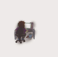
 I wanted the real world to be represented as this dark claustrophobic place, that's almost shut in on itself in the dark - I wanted it to be a huge contract to what had just been shown, how the online world contains so many possibilities and so much fun but the girl behind the character can never experience those possibilities within her own bedroom; and yet that is the only place she CAN experience the online world. I purposely designed her bedroom with dulled brighter colours, like green,blues and pinks. I also added a window, which is partly open showing that there is light outside her bedroom but it doesn't attract her - she's too engulfed in the online world.
- The first layer was the female player, at her computer. I didn't want her to ever appear to be drifting away from her computer - so kept the two on the same layer. I highlighted everything facing the computer screen and shadowed everything else heavily.
- The second layer was the 'posters' I wanted them to grow slightly smaller as the camera pulls away from the female player, so I needed them to be on their own layer
- The third layer was the window, which carries it's own highlight that shines down from beneath the window curtain. I wanted to keep this separate from the wall, because I wanted to expand the light across the floor slightly in the final version. Which is something I didn't end up doing because I couldn't do it without stretching out the whole window.
- The fourth layer was the teddy bear and bed, both were on separate layers with slightly different highlights - they both have the same keyframes - such as scale and position.
- The fifth layer contains the walls/floor/ceiling of the female players bedroom. It's heavily shaded as you can see
- The last layer is a 'blue dusting'. Whats a blue dusting? It's what I call an over shadow, a sort of 'screen' shadow that I fade in slowly as the camera pulls away to give the illusion it's getting darker.
Setting keyframes involving position/scale was pretty simple, because I knew what I was doing. I'm really happy with the results.


No comments:
Post a Comment