After animating such a short sequence which was literally 5 frames, I realized how difficult it was going to be animating in such a way... So instantly abandoned any idea of doing this style by hand or animating any quicker then I had in the test footage.
Wednesday, 20 May 2015
Applied Animation// Early Animation test Vs Final
After animating such a short sequence which was literally 5 frames, I realized how difficult it was going to be animating in such a way... So instantly abandoned any idea of doing this style by hand or animating any quicker then I had in the test footage.
Using Maya// Bouncing the Balls.
I was already familiar with the keyframes by now, considering I had already animated the other tasks which involved being aware of that function within the software; so this task I found slightly more fun and not at all stressful compared to the previous tasks. I ended up screwing up the animation the first time because I totally forgot to set keyframes for the scale of the balls... so ended up with this weird tiny egg shaped ball rather than it's original shape. But after redoing it.. I ended up with the animation shown above. Which I'm quite happy with, it bounces doesn't it?
Using Maya// Segmented Pendulum
Animating it was a simple case of setting keyframes with positions of all the pendulum, then using the Cv curve tool I dragged each joint slightly behind the original movement by about two frames; resulting in a sort of delay in movement. A very realistic delay within the swinging of a segmented pendulum. I will admit I had a lot of help from a good friend of mine, James when animating this; because I really struggle with using Maya and anything to do with a computer as it is. However I feel like this animation is very beneficial to learn from, because secondary motion can make the most unrealistic thing come that little bit more to life.
Using Maya// Anticipation
Using the model I had already created today, I animated a short sequence in which the lid of the 3DS hesitates before slams shut on itself. The timeline of Maya is pretty much like the timeline in photoshop when animating, so I found it quite easy to animate. However what was knew, was that I had to set keyframes for a lot of things, such a scale and different rotations such as x & y.
Maya// Turn Table
I recreated the model I crafted in Maya (3DS) but this time I spent more time on the texture of the model and its colour. I added on a texture that recreated shine across the screens and also added colour to the form.
To animate a simple turn table is pretty simple in Maya, in fact it's as simple as an option from one of the menus. -You first need to have the side bar on 'animate' - Click the Animate menu on the top bar -then click turn table. It's as simple as that. I was shown how to do this by a good friend of mine - Called James. This instalment into the software I found a lot easier and enjoyed the whole process a lot more then the first time I tried to model or animate anything. I'm also a little proud of myself for creating this simple animation, despite it being so simplistic and easy to do; I really like how professional it looks.
Tuesday, 19 May 2015
Applied Animation// Evaluation
For this project I was given three briefs to choice from; the first involved animating two indents intended for television channels, the second focused on animating a title sequence of a book that hadn't already been adapted into some sort of film and the last was to animate a sort advertisement for a charity. I choice the brief of Title Sequence because I found the idea of animating something based from literature very existing.
I struggled at the start of the project, because I ended up developing not one but two books into a few days of production and later dropping them. The first 'Hairy Maclary' I found was already animated back in the 70's for the BBC and the second 'Swans In Space' I found incredibly dull and lifeless after a few weeks of concept work. Luckily I stumbled across a graphic novel in my local comic book store that I was instantly inspired by after flicking over the first few pages. 'In Real Life' is a comic that focuses on a teenage girl who isolates herself playing an online multiplier game and feels that she experiences more out of life online then in the real world. I was driven by the stories heavy political undertone within the comic to work over time in the concept stage in order to not fall behind on world; I really wanted to animate a title sequence for such an awesome story concept.
I wanted this animation to be a little more different compared to my previous animation projects, regarding the visuals. A lot of my animations are very 2D with heavy outlines; I wanted to avoid doing this and being inspired by our regent Maya inductions I wanted to attempt animating without a solid outline, which is something I had never done before. Originally I was also wanting to animate this on paper with watercolors, but quickly scrapped that idea after remembering how short this project was going to be and how long it would take to animate like that. So I began animating on a computer, animating entity on a computer was also something else I had barely experimented with and was happy to experiment with again. Looking back at the project I wished I had incorporated more medias into the project... such as watercolour.
I found the hardest part of the entire project was animating the first segment with the main character, where the camera moves around her. I used no reference besides trial and error so it was really hard to get right, despite it only being a second of footage I really worked my socks off on getting the movement as realistic as possible. I'm most proud of this part of my animation, partly because of the effort and experimentation I put into it and the fact after so many failed attempts I managed to get the animation to look right. I'm happy with choosing to rely heavily on a computer for this project; because now I feel I am more comfortable with Photoshop and after effects (especially using layers in both softwares)
I really enjoyed working on this project, despite getting so frustrated at times at relying so heavily on a computer. There are still a few animations errors within my finished piece that I want to revisit but over all I am incredibly proud of what I've managed to animate in this project.
Monday, 18 May 2015
Applied Animation// Crit
Today all my class presented their animations for this project to the group - to receive opinions on our final piece of animation and to discuss suggestions. I had finished my animation about 3 days ago so I had already had time to reflect on the animation I had completed by myself...
Presenting my work I got a lot of positive feed back, but opportunities for improvement were brought up - Such as the character names lasting longer on screen and perhaps a slower pull back of the visual movement in the last sequence. I'll try and fix theses 'improvements' with the time I have left. Feedback from my tutor included 'lovely visuals, computer animation' and 'font, text placement'.
It wasn't pointed out but there are a few animation errors in my 'final piece' - I'll be sure to go over them and improve them if I get the time to also...
Saturday, 16 May 2015
Applied Animation// Foam
This session we were going to finally create our foam figure in which we could then animate.

With the two molds (the two of them of each half of my figures form) we tightly bound the two against each other, before finally pouring the liquid foam into it. The liquid version of the foam expands and developed a form over time within the molds - to make sure the foam didn't just run to the bottom of the mold and coated the whole mold, we had to tilt the mold carefully as the foam expands inside.
The first attempt didn't go very well for any of my classmates or for me. The foam figure was weird, bubbly and some segments of the mold hadn't even been foam'ed - the teacher leading the session thought it had something to do with the way he'd mixed the mix. Second attempt rolled on around and the end results were a lot better, despite the fact there were still air bubbles within the foam.
I really enjoyed my introduction in to ceramics, especially how I was able to design a character then I then could make - and given the possibility to give my own character (my baby) LIFE.
Applied Animation/// Taking a mold
With out existing models we removed them from their stands, placed them down in a clay holder and took a mold....

The first thing we did was carefully remove our models from the wooden stand, and drew a slit around the edge of them; making a rough estimate of half of the model. Next using clay we made a base that reached up the model and only exposed half of it (the edge we just scratched carefully around the edge of our model) and then made thick clay Secure walls around the base, for the plaster to be poured into. And then finally, we poured the plaster in.... It was very important to have crafted thick secure walls because one student had his wall collapse - and plaster poured all over the studio.
After taking the mold we then repeated all the steps but with the other half of the model...
Applied Animation// Model flesh
This session we focused on giving skin to our man made tiny wire and Millie Put skeleton.

We used Plasticine to fill out the wire frame and give model a form rather then a very simplistic basic skeleton shape. My design was very slim and elongated - however some models that were being working on were much chunkier then my own, and if were filled out entirely with Plasticine would be far too heavy, so the models were filled out mostly with light weight material - Paper.
I loved this part of the process, because I could really bring my model to life with features and even hair. I've only ever worked with clay for scale models of characters I have designed, I had never used Plasticine before but I really enjoyed using it! I really enjoyed th
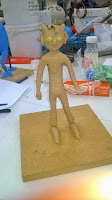
Applied Animation// The Model
A part of this project is experimenting with model making regarding stop motion within animation - we were given lesson time in ceramics as part of a ceramics induction. This induction involved us designing our own characters and making them into 3D stop motion models.

In the first lesson we focused on designing our own character and then using the scale design to craft a skeleton base for the foam model. We used flexible wire to craft the skeleton - But to give a bit of resistance and support to the skeleton, we did this by attaching a drill to the wire and twisting it. However for the joints we used a material called Millie Put (which in turn was two materials mixed together that would harden over time), attaching the Millie put to the wire were the joints of the elbows and knees would of been it then hardened over time so the wire could only be manipulated into movement from these joints. As for the solid shoulders and hips we attached plastic teeth to give it more structure.

In the first lesson we focused on designing our own character and then using the scale design to craft a skeleton base for the foam model. We used flexible wire to craft the skeleton - But to give a bit of resistance and support to the skeleton, we did this by attaching a drill to the wire and twisting it. However for the joints we used a material called Millie Put (which in turn was two materials mixed together that would harden over time), attaching the Millie put to the wire were the joints of the elbows and knees would of been it then hardened over time so the wire could only be manipulated into movement from these joints. As for the solid shoulders and hips we attached plastic teeth to give it more structure.
Applied animation// Music for animation
I was watching 28 days later with my friends and heard the song come on - I thought it was perfect for the aesthetic I wanted for this project and found it even more perfect that the intro for it was only 29seconds long.
Comparing the soundtrack with my animatic I was ecstatic to find that the music picks up pace exactly as the animatic does - so instantly downloaded it. I'm aware of the copyright problem and the fact youtube has blocked the animation in Germany because of the sound. I may replace the audio later to use it more efficient online to promote my work further... even if it's just in germany.
Applied Animation// How music can be used effectively
Music (at least in my opinion) is equally as important in a title sequence as the visuals. For instantly, the visuals may be stunning however the music will be remembered long after the credits roll.

The Supernatural titles have the song 'Back in Black' by AC/DC, which is now a song that is associated with the series and vice-verier. Not only this but the original Shrek movie has a fantastic soundtrack but the songs will forever associated with Shrek. To the point where the instant the song comes on - you think of Shrek. This is also the case with a certain song from IceAge - 'Send me on my way' by rusted root is a song I can't help but listen to and think of Ice Age; and neither can my friends.
In Japanese animation the series opening theme is very carefully picked or even recorded especially for the series, the series Naruto (with over 60 opening titles and still counting) have collected opening themes from a vast number of artists.
In my animation I want to choice a song that's very digital, possibly 8bit music (video game music) that is also mixed with some sort of rock or possibly pop.
Friday, 15 May 2015
Applied Animation// depth in photoshop layers and after effects
 I wanted the real world to be represented as this dark claustrophobic place, that's almost shut in on itself in the dark - I wanted it to be a huge contract to what had just been shown, how the online world contains so many possibilities and so much fun but the girl behind the character can never experience those possibilities within her own bedroom; and yet that is the only place she CAN experience the online world. I purposely designed her bedroom with dulled brighter colours, like green,blues and pinks. I also added a window, which is partly open showing that there is light outside her bedroom but it doesn't attract her - she's too engulfed in the online world.


 |

- The first layer was the female player, at her computer. I didn't want her to ever appear to be drifting away from her computer - so kept the two on the same layer. I highlighted everything facing the computer screen and shadowed everything else heavily.
- The second layer was the 'posters' I wanted them to grow slightly smaller as the camera pulls away from the female player, so I needed them to be on their own layer
- The third layer was the window, which carries it's own highlight that shines down from beneath the window curtain. I wanted to keep this separate from the wall, because I wanted to expand the light across the floor slightly in the final version. Which is something I didn't end up doing because I couldn't do it without stretching out the whole window.
- The fourth layer was the teddy bear and bed, both were on separate layers with slightly different highlights - they both have the same keyframes - such as scale and position.
- The fifth layer contains the walls/floor/ceiling of the female players bedroom. It's heavily shaded as you can see
- The last layer is a 'blue dusting'. Whats a blue dusting? It's what I call an over shadow, a sort of 'screen' shadow that I fade in slowly as the camera pulls away to give the illusion it's getting darker.
Setting keyframes involving position/scale was pretty simple, because I knew what I was doing. I'm really happy with the results.
Applied Animation// Puella Magi Madoka Magica
I pertically like the running sequence, especially how the structure of the characters surroundings move across the screen, blocking her out from time to time - it really gives the sense of urgency and rushing. I also like how 'flashes' of the main characters are all that are seen, 4 of the 6 main characters are only on screen for 0.5 seconds, but that quick flash is enough to be engraved in the viewer's mind. Towards the end the pastel shades are dropped and replaced with this sort of foreshadowing dangerous red and black, foreshadowing within itself the series rather sinister storyline.
Applied Animation// Animatic
This animatic is ALREADY 31 seconds long which is 1 second over the limit for this project. I'm already aware that the final animation will be far too speedy, so I will have to slim down the animation or perhaps simplify certain scenes. But for the 'turn around' animation, I'm going to use the animatics layout sketches as a sort of base for the final animation I will animate...
Applied Animation// Research - Juno

The opening for juno is a personal favorite of mine and was one of the first intros for a live action film I thought of when thinking about inspiration for my own. A rotascoped animation, where footage is filmed then traced over by animators - this intro gives the impression of a certain naivety and the sense that the main character herself feels very disconnected from her surroundings. The aesthetic of the titles in which Juno is depicted as more realistic then her surroundings, her surroundings being very muted compared to her - gives the impression Juno doesn't feel like she's associated with the world around her, it also gives the impression she's got a lot on her mind, to the point where she doesn't have time to notice every detail around her... hence why her surroundings are so simplistic they're almost naive. The colours are also so lovely, highlighting details in this short opening that NEED to be noticed or are relevant to the movies storytelling.
Applied Animation// Research - Scott Pilgrim VS The World
Applied Animation/// Maybe Next Time...

Applied Animation// Current 'completed' animation (what needs improvement)
So far I've animated 18 seconds out of the over all 30 seconds for this project...
Working with the two segments I've already blogged about I've added an additional segment that shows both characters attacking the monster, the camera pulls up and the title is displayed in the sky.
I'm happy with what I've animated so far - quite impressed with myself that i've managed to 'sort of' time the animation with the background music. But here are a few things that need improvement...
Working with the two segments I've already blogged about I've added an additional segment that shows both characters attacking the monster, the camera pulls up and the title is displayed in the sky.
- The title 'In Real Life' fades in and moves onto screen however, it 'jumps' into place towards the end rather then is placed there. I need to make this movement more fluid.
- In the animation at 0:05 - 0:08 I need to animate and drawn in Emma's character
- I also need to remember that the 'blank' space in between Emma's character and the monster at 0:02-0:05 needs to have text placed there in the final version.
Applied Animation// Creating a 3D world within a 2D one VERSION TWO
A few days have passed and I've been working on this scene in particular.
I like the effect the blades of grass give to the animation, with them being so close to the viewer then moving away alongside the characters turning - as the camera does. But I still felt I was missing a little something... So I added in clouds. The monster was purple and really stood out from the scene, so I decided to make the clouds a pinkish to really pull together the colours in the scene and not make it too busy with colours or shades. I animated the clouds in a way that gives the illusion they float across the sky - zoom past as the camera does - then continues to float past in the same direction as before, despite the camera now being in a different position.
I feel like the clouds really help emphasise the movement within the scene and sort of help as a 'anchor' for the whole movement of this segment; that helps the viewer really translate what's happening within the animation.
Applied Animation// Creating a 3D world within a 2D one VERSION ONE
Using the simplistic animation I animated over the easter holidays, I began to blend it with photoshop layers using After Effects. Learning from the experimental animation I did before the holidays in which I tested out using layers in After Effects and their position/scale to give the impression of a more 3D world in a 2D one - I used blades of grass to really emphasize the movement within the animation, since i felt looking back at it the animation on it's own wasn't too obvious that the camera was moving around her rather than the character turning on her own. I also added in a monster, that curls around the horizon and grows larger as the camera zooms in on the scene slightly.
All of this was achieved with keyframes, in the transform setting of layers - assigning keyframes within the position and scaling of each layer working with each other to create the illusion of 3D.
However, I feel like this animation is missing something. I feel like I can add something more to emphasise the scene and the 'look' I am going for regarding this scene...
I'll try again tomorrow - see what else I can add.
Applied Animation// GIMP animation and layers in Photoshop
I wanted to use the sequence I animated over the easter holidays (using GIMP) with Photoshop layers in After Effects - Like I did with an experiment I animated with the three softwares a few weeks earlier.
In this experiment I used layers in photoshop to give the appearance of a more 3D world, with segments of drawings 'moving past' the viewer to give the impression of movement within the animation. For example, the flowers and grass closest to the screen move off screen but also increase in size - giving the impression of the camera moving into the drawing. I also added a 'light' effect to highlight certain elements of the over all comparison as the layers slowly moved against each other.
I edited the layers together all in After Effects.
Adding all the layers into the comparison layered up, I could then edit the position and scale of each separate image. To give a '3D effect' to the flowers in the front, I set keyframes with the position and scale of the image - moving the flowers off screen and increasing their scale. I did the same thing for all of the layers, the horizon lowers slightly, along with the blades of grass 'attached' and the figure moves slightly to the right and becomes that tiny bit bigger; all to give the impression of a 3D world. I'd like to revisit this effect in my final animation, but only in the 'real world' part of it....
Using Maya//Pengalum
Animating it I found surprisenly easy and A LOT like after effects - because you set simple key frames and the computer sort of 'fills in' the animation inbetweens for you. Despite this short animation being - well - short. I'm quite proud of this, this simple pendulum is the first 3D computer animated animation I've ever created. So this simple little thing has a special place in my heart.
Subscribe to:
Comments (Atom)