I animated this on photoshop, using keyframes within the timeline function to give the illusion of movement to the illustration. It's a shame I couldn't get the background to loop nicely, because the final Gif does JUMP between beginings and end of the animation quite oviously.
Tuesday, 29 December 2015
Responsive// OnFormSketches WEEKTWO
I animated this on photoshop, using keyframes within the timeline function to give the illusion of movement to the illustration. It's a shame I couldn't get the background to loop nicely, because the final Gif does JUMP between beginings and end of the animation quite oviously.
Monday, 28 December 2015
Responsive// LoopDeLoop Sisters - Finish Animation
I feel like this entry will be taken very successfully (as a month later I've gained over 100 followers on my Tumblr from this entry on Loop De Loop) for my digital representative pages. And I'm also very pleased with the final outcome of the animation. I struggled to maintain a steady line with my drawing tablet because as of recently my hands have been trembling alot; which in the end I feel, resulted in a nice 'style' to the animation. This was animated at 12FPS, as I didn't have the time (along with working on other university projects) to commit a little more with 24FPS. I feel I've become far more confident with animating within the photoshop timeline only since beginning this project.
Sunday, 20 December 2015
Responsive// OnForm Sketches WEEKONE
OnForm is a tumblr base 'contest' held weekly, where artists must take the shape submitted and adapt it into something new; only being able to use black and white. I heard about this sort of 'contest' from fellow class mates a few weeks ago and finally started applying to their weekly shapes - TODAY.
When looking at this weeks shape I couldn't really see much besides someone with their arms crossed. This thought ended up as show in the GIF, a lady in her window crying.
I feel like entering these briefs will be benefits for my social media following because Tumblr is a very popular stage for curatives to present their work as well as advertise freelance business.
Thursday, 10 December 2015
Responsive// LoopDeLoop Sisters Storyboards
Below are very rough storyboards I've developed for my entrance for 'Loop De Loop' this January, which is titled 'sisters'. I want to rely on comedy rather then violence in this short looping animation, so indeed replaced a punch with a brofist to avoid violence in this short. I may change a few shots here and there to really make use of screen space when animating but then again, this storyboard is only my 'first draft' of the idea I have for this contest that is visual.
I used post-it notes when developing the rough storyboard, as featured below;
I've also been inspired by 'SUN CREATURE' studios animations titled 'the reward'.
I've blogged about finding these animated films very inspirational as an animator and story teller, the comical vibe from their animations really helped me storyboard my idea out for this brief.
Responsive// LoopDeLoop sisters
For this time around Loop De Loops theme is 'sisters'.
I want to start working on this contest entry over the Christmas holidays because I plan to stay in Leeds for that time, so I'll be able to use the software and computers in university to animate this.
'' Having a sister is a relationship that you can born into or have forged over lifetime of friendship. For those of us who have a sister, we know that there are times when they can be our greatest competitor, our closest friend or a sage councillor. With such a wide range of experiences there is plenty of inspiration. So let’s show our respect to all the hard workin’ gals out there and create some awesome animations!'' -(Loop De Loop website)
So far I've developed one idea, from a real life event; yesterday I was walking around town with a dear friend of mine, a friend I regard as a sister in many ways. Someone whispered something perverted about us both as they passed us on the street, some sort of overly sexual definition of us both. Both me and my friend, however didn't feel at all bothered by it because we've got each other. We're sort of like a two person girl gang her and I, so when I'm hanging out with her I don't feel an inch of intimidation from any remarks people give us. So for this 'Sister' brief I want to focus on 'Girl Gangs' and how they combat sexist remarks in the street. I feel like this project brief will benefit me as an animator because Loop De Loop is a very popular website for animation students to gain a digital presence and social media presence and considering there's no entry fee there's really no costs involved - which is something I'm ALL for!
Below are a few concept drawings of the two girls for this brief:
Wednesday, 9 December 2015
Telling Tales// Demo model turn around PROBLEM!
Yesterday I managed to finish the 'Demo Model' set to finish at the start of this project, I was rather confident everything had been done correctly up until the last moment; when this happened (image below)
I have no idea what went wrong and was unable to fix the model in time. My only guess for what happened to the model would be that some how the joint based at the bottom of the models chin that was bound to the model was some how effected when the camera entered the environment and went shooting off to the right. I could of fixed this in various ways; the most effective way being making sure the head joints were fully operational and wouldn't fly off when moved slightly. If that is the case then something must be wrong with the control to joint relationship/parental values. It's too late to change anything now, I'm sorry Matt (tutor)!
I have no idea what went wrong and was unable to fix the model in time. My only guess for what happened to the model would be that some how the joint based at the bottom of the models chin that was bound to the model was some how effected when the camera entered the environment and went shooting off to the right. I could of fixed this in various ways; the most effective way being making sure the head joints were fully operational and wouldn't fly off when moved slightly. If that is the case then something must be wrong with the control to joint relationship/parental values. It's too late to change anything now, I'm sorry Matt (tutor)!
Tuesday, 8 December 2015
Blending CGI with live action - Jurassic world
Recently I watched the newest installment of the Jurassic park series - Jurassic world - for the second time, since it's release. After discussing it over with a friend we both agreed it was rather sad how the film now relied on computer animation rather then puppetry and special effects. Despite the fact the computer animation blended seamlessly with the live action footage it really did feel like it had lost a certain something; but we both couldn't settle on the fact if it lost something to the franchise or the film industry (her herself being a fan of old special effects and me loving hand made film making). Although the film did feature anatomic dinosaurs they were filmed and used for lighting references or for very short moments to regain the films history using that technique.
It's clear the graphics in the latest installment look amazing, as well as the models movements and animation the CGI of the dinosaurs make them look incredibly realistic and believable. I wouldn't be surprised if certain areas within the movie were entirely computer generated, seamless with the live action footage. The actors themselves were filmed with green screen then composited within the 'Computer animated' scene. When the 'Jurassic Franchise' moved away from using stop motion CGI dinosaurs were composited into live action footage - but in 2015, the tables have turned.
In many ways, I feel like computer animation has a limitation in itself; the fact it IS 'computer animation' is a problem to certain lovers of film. Sure, you can achieve far more with computer animation than special effects but certain viewers adore the dedication to a movie to produce everything visually by hand or on set. But is that far? Is it okay to bully poor young CGI animation, flawlessly composited and stitched into a movie for your entertainment? Or is it because the script is bad? Computer animation is in no way a replacement for story, I've read review after review of this movie complaining about the studio moving away from 'traditional special effects' and choosing the 'easier' way out. Honestly, the film wasn't that well scripted; I do feel like the computer animation was the leading factor to the studio when producing this movie which really isn't anyway to make any sort of movie. In all honestly if computer animation looks wonderful if not better then what can be achieved in reality then why not make it all animated? Could it be that animation has a stereotype with being childish? Could it possibly be the cost? Or perhaps the investment in heavy furnished animation software and computers that many studios would have to invest in, in order to compete with this ideal? Computer animation still has a long way to go in my opinion, both as an art form and a reconsidered industry outside gaming and 'additional' effects.
 |
| Un-textured model next to textured model. |
In many ways, I feel like computer animation has a limitation in itself; the fact it IS 'computer animation' is a problem to certain lovers of film. Sure, you can achieve far more with computer animation than special effects but certain viewers adore the dedication to a movie to produce everything visually by hand or on set. But is that far? Is it okay to bully poor young CGI animation, flawlessly composited and stitched into a movie for your entertainment? Or is it because the script is bad? Computer animation is in no way a replacement for story, I've read review after review of this movie complaining about the studio moving away from 'traditional special effects' and choosing the 'easier' way out. Honestly, the film wasn't that well scripted; I do feel like the computer animation was the leading factor to the studio when producing this movie which really isn't anyway to make any sort of movie. In all honestly if computer animation looks wonderful if not better then what can be achieved in reality then why not make it all animated? Could it be that animation has a stereotype with being childish? Could it possibly be the cost? Or perhaps the investment in heavy furnished animation software and computers that many studios would have to invest in, in order to compete with this ideal? Computer animation still has a long way to go in my opinion, both as an art form and a reconsidered industry outside gaming and 'additional' effects.
Wait, Rendering?!
Rendering.
Rendering is well known to all creatives from different technical fields; but arguably, not as well known as it is to an animator. That's right, the process of finally converting all that hard work of yours may well take what seems like forever to complete before you can even see it move outside of it's production software!
Pixar studios 2001 animated feature 'Monsters INC' featured a character design with very 'complex' character texturing. One lead character 'Sully' was designed with a lot of pink and blue dotted fur which when approaching the 'new territory' of digital animation in the western world was quite the intimidating task to achieve within Pixars studios. Pixar began work on the 2,320,413 hairs on the main characters body which became quite the struggle to grasp an idea to animate this in an effective way and had to bare in mind that each hair would cast a shadow on the hair beneath. Several animation tests occurred until they achieved the animation quality needed for sullys hairs; including some sort of obstetrical course environment for the character to be tested within. After weeks of hard work on sullys hair software alone, the studio was met with the rendering time - 11 to 12 hours to render a single frame of sully.
Rendering requires a lot of computer power, which arguably the reason why more 'realistic' looking computer graphics didn't start to pop up and begin development until the 90's despite the fact computer animation had been developing since the 70's. Back in the 70's computers didn't have the capability or power to render out or support such complex animation models/effects. Continuing to this day, groups of powerful bulky computers were be clustered together and used only for rendering. The limitations of computer power previous to the 90's computer capabilities such as the Pixar computer was heavy for the industry. The poly count for eariler animations was very less then is capable in these recent years; for example comparing John Lasseters first CG animation to the game graphics from 'the last of us' it's clear to say computer power has come A LONG WAY since the 70's!
Telling Tales// Finished Model!
Below is a youtube turn around of the finished model I'll be animating for this project 'Adrift'. This model and I have been together now for a few days now - long stressful days. I'm also demonstrating the 'Pokoyo' lighting here, although I did have to turn it down slightly to a soft shade of grey because I found the model looks far too angelic with it on 100% lighting. I also animated the model slightly to give it a bit of 'life' because honestly, I'm going to show her off. I've been watching her rig-less, unmovable model for a few days now and I'm going to show her off!
Telling Tales// Rigging and the controls (Even painting WEIGHTS)
Moving on from the UV mapping stage I began working on the rigging of the character - the 'rig' itself being the some what animate-able skeleton of the character, beneath the characters surface.
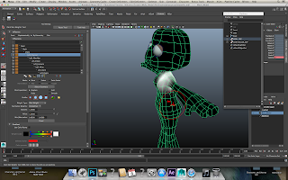
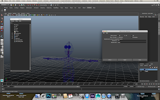
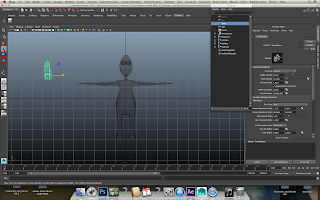
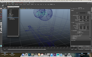
Rigging basically consisted of forming a sort of 'hierarchy' of child to parental joints and controls, located at various points around the models form; all of which were connected to the 'root' of the entire model. I then had to assignee the points of oppression to each control to the corresponding and relevant joint. After that I assigned in the outliner relevant folders with their controls; in which I first had to constraint the joints to the folder and its controls. Basically in the end I was left with a hierarchy of controls, folded up nicely within each other from the controls to the next and so on. I then began painting 'weights' on to the model, to restrict certain unnecessary movement when rotating controls and moving them.
Painting the weights I found quite simple but tricky to get the hang of. Really all it involved was visualising areas you wanted to be restrained from the effects of other controls (like the ears being effected when the head was rotated). However I did notice after I began the animation progress that the left ear of the model moves slightly when the head turns; the weights on that ear much be off slightly, or not 'heavy' enough to really cut off the additional movement from another control.
I attached realistic humanoid joints to the character, having to take a step away from the human skeleton refrence I had when approaching the arms and legs of the character. My character is designed very cartoon like, her wrists and ankles aren't defined ( or elbows ) because of her elonggates limbs. So I rigged her elbows and knees to rough areas down her limbs where I would want the model to bend. With her ancles I based the joint at the base of her foot, because her legs are very 'hoof-like' I'll just have to watch how I animate the character and what looks 'too' rediculas.
Below are a few screen shots of the finished rigged model (complete with visible weights):
Telling Tales// Fixing the control hierarchy and binding!
Above is a screen shot of the CORRECT hierarchy layout for the controls, with each within the controls of another. For example the controls linked to the joint/control of the hand, is within the control of the elbow, which is in turn within the control of the elbow. Everything is basically stacked on top of each other.
I also discovered I had done this wrong the first time redoing it, so had to do it all over again. This time I had to redo it because I had forgotten to 'freeze' the controls within their corresponding folder. I also missed a small part when constraining joints to their folders which added up to a big error in the over all hierarchy.
Above is a screenshot of the finished bind-ed, control operated demo model! (yay!)
I had a mini-heart attack after completing it for the 4th time without errors to find when I rotated the arm it glitches and went shooting off right and away from this reality. However not to panic, it was simply because I hadn't selected the control I had selected the joint itself and attempted to rotate that instead!
I honestly don't know if I'll have much time to fix the little problems this model has here and there before the deadline, I completely forgot that this model needed to be submitted and now I find myself finishing it in the last few hours before submission. Wish me luck about meeting my deadline (please)!
Monday, 7 December 2015
Telling Tales// The sound
For this project we both wanted a heavy sense of uneasiness to be incorporated within the animation with sound. We also wanted some sort of narrative over the top of the animated and sound, which would describe the sensations occurring.
After finding a few sound clips online I began merging them together in after effects, experimenting with the 'sound wave' function and key frames to heighten the emotions the character would be feeling. I selected some 'television static' and a few samples of street sound; I didn't edit the sounds together too viciously because I didn't want to drown out the narrative provided and written beautifully by James Grimshaw.
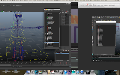
Below is a screen shot of the sound 'mixing' I achieved in After effects with keyframes,
Telling Tales// Rigging the model AND Controls!
Rigging a 3D model for animation is essentially creating a skeleton for that model, so it can be animated within a digital field. It generally involves merging the model together with appropriate joints and restricting certain areas to movement.
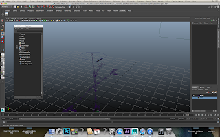
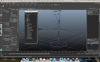
Today I began work on the skeleton of the model,
Today I began work on the skeleton of the model,
After creating some eyebrows for the model I began working on the controls,
 |
| Continuing with this technique I created the controls for the eyeballs in a similar manner, however this control floats in front of the model. |
Saturday, 5 December 2015
Telling Tales// File problems
Yesterday after attempting to change over my files for this project from the scratch disk something went wrong. I ended up losing half of everything I had, including original animation files for easier scenes, which I luckily rendered out in aftereffects the day before. However I've lost several animation shots/textures as well as accidentally frying someones memory stick… Below is a screen shot of one of the few scenes I have left:
Sadly I lost the other two saved scenes files of the continuation of this animated shot, so I'll be using the animatic that I developed to replace the lost footage because of the deadline being so close to me writing this currently. I'll be rendered out the final movie tomorrow and then I'll hand over the After Effects file to my work partner so she can add in her own parts of the animation. Wish me luck!
Sadly I lost the other two saved scenes files of the continuation of this animated shot, so I'll be using the animatic that I developed to replace the lost footage because of the deadline being so close to me writing this currently. I'll be rendered out the final movie tomorrow and then I'll hand over the After Effects file to my work partner so she can add in her own parts of the animation. Wish me luck!
Tuesday, 1 December 2015
Telling Tales// Rendering out worries
The first rendering of a scene for this project occurred today,
to my surprise it didn't take hours but in fact 30 minutes to convert the Maya folder into frames. After the render was complete I transferred the digital frames into After Effects to begin the Post-Production side of the project for this segment of animation. I had over stepped my deadline to begin animation, so had to abandon the idea of somehow animating the mouth of the character onto the model that I had within Maya before I rendered it. I was from the very start going to animate the black goo and bubbles featured in our project in photoshop then key frame it up with the Maya animation in AfterEffects, so approached the 'mouth problem' with a similar technique. I illustrated a basic mouth shape in photoshop in a transparent PNG format and keyframed its position, scale and rotation over the Maya animation to move correctly with the characters movements. After having to change the opacity of the illustrated mouth slightly to help it blend into the Maya animation I was very pleased with the outcome!
I animated the 'bubbles' in the same way I animated the characters mouth, by setting keyframes around the model. I also added the Wiggle function to the rotation of the bubbles, to help them look unstable and dangerous; which i knew would be hard to animate in their movements considering bubbles move quite fluidly in the air and aren't the most threatening of objects. Below are a few screenshots of the process of animating the bubbles and mouth:
to my surprise it didn't take hours but in fact 30 minutes to convert the Maya folder into frames. After the render was complete I transferred the digital frames into After Effects to begin the Post-Production side of the project for this segment of animation. I had over stepped my deadline to begin animation, so had to abandon the idea of somehow animating the mouth of the character onto the model that I had within Maya before I rendered it. I was from the very start going to animate the black goo and bubbles featured in our project in photoshop then key frame it up with the Maya animation in AfterEffects, so approached the 'mouth problem' with a similar technique. I illustrated a basic mouth shape in photoshop in a transparent PNG format and keyframed its position, scale and rotation over the Maya animation to move correctly with the characters movements. After having to change the opacity of the illustrated mouth slightly to help it blend into the Maya animation I was very pleased with the outcome!
Telling Tales// Animation test, developes!
I've also been working on another piece of movement of the character today.
The character is walking down the street and gesturing around, telling a story to her friend. Below are the key frames I set to achieve this motion, which I based off a video file I filmed of myself gesturing around. Before I set the key frames for the movement, I first animated a basic walking cycle to help me keep the pace of her walking then I animated her gestures. I found this way of approaching the movement in animation was beneficial because I didn't have to focus on keeping her strides fluid as well as setting key frames to her gestures.
 |
| Key frame 1 |
 |
| Key frame 2 |
 |
| Key frame 3 |
 |
| Key frame 4 |
 |
| Key frame 5 |
Telling Tales// First animation 'test'
I'll continue working on this animation shot tomorrow...
Telling Tales// The Enviroment
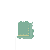
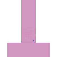
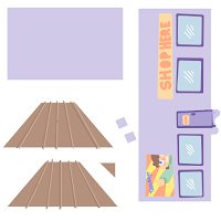
For this project we wanted to base our short 1 minute story in somewhere 'public' but knowing our limitations with modeling, we decided to avoid applying mulitable background characters to our set; so instead decided to focus on an area typically associated with being public, like a highstreet. I kept to a very basic structure for the environment, keep to the cartoony look I drew the texture out on photoshop in a rather 'naive' visual aesthetic. Below are the texture maps I used for the environment:
The environment is only built with a thin plane for the road, the pavement and a cube for the shop. I also modeled lamp posts because I felt like the environment was almost too basic looking.
Below is a screenshot of the rendered environment with the 'Pokoyo' lighting and an area lighting :
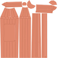 |
| Lamp Texture |
 |
| Road Texture |
 |
| Pavement Texture |
 |
| Building Texture |
The environment is only built with a thin plane for the road, the pavement and a cube for the shop. I also modeled lamp posts because I felt like the environment was almost too basic looking.
Below is a screenshot of the rendered environment with the 'Pokoyo' lighting and an area lighting :
Telling tales// Pokoyo lighting test
Today my work partner and I tested similar lighting to that featured in the children's animated series 'Pokoyo'. We decided to test this lighting because we felt the colour pallets and over all character design for our characters would be well complicated with this particular lighting; considering our character designs are similar in a cartoony way to those featured in Pokoyo.
Both me and my work partner both really liked how the rendered images with the lighting looked, so we've decided to use this lighting for our project. However using it with the environment gave the street I'd modeled this dull dark shadowed appearance - But I easily improved the quality of the lighting by adding a simple Area light, hovering above the whole environment.
We achieved this lighting effect by following these steps;
- In 'Render Settings' click the 'Render Using' opinion of mental ray
- Next scroll down to 'Render Options' and make sure the button 'Enable default lights' is un-clicked
- Then under the 'lighting' segment of Render settings, make sure 'Global illusion' isn't clicked and that 'Final Gathering' is
- Finally in the outliner under 'perspective' (or the camera you're using to render out) make sure the environments environment background colour is white
- If nothing strange occurs within Maya, these steps should allow you to achieve the 'Pokoyo lighting'!
 |
| Here is a screenshot of the finished lighting (on just the model) |
Subscribe to:
Comments (Atom)


