Thursday, 11 May 2017

Critical Evaluation

I wanted to make a film that reflected on my previous 3 years of studying and living in Leeds. I also wanted to create something that was relevant to the current western political climate the UK and America are dealing with, as well as acting on my social responsibility by applying my opinions to my artistic expression. I’m openly a left-wing creative and I’m passionate about protecting the arts as an industry and as a culture, Brexit and currently ring-wing politics threatens the freedom of expression - especially in the arts and even more so in society. Currently stereotypes based on prejudices against religion, sexual orientation, race and nationality, gender and age are becoming more prominent I personally feel than in the last 3 years I’ve been classed as a ‘student’. So I wanted to create a film that takes the idea of having your feet on the ground and feeling welcome, feeling at home and being able to do what ever you want to do despite any prejudices that exist against you and visualise it in a way that wasn’t straight up political. 

The main character Benjamin represents a minority who faces prejudices against him based on his identity. Some are negative towards him because he is a fox, some are positive because he is a fox; but both rely on their ideas of him as an individual because of his identity. I wanted to make it clear in the film that pedestaling someone based on a stereotype of their identity, is the same as excluding them in my own opinion. Because that person will be alienated, purely because of their identity even if those alienating them see it as a positive or as a negative. Benjamin also represents my own anxieties about the UK, I was relying on being able to travel and work freely across Europe as a freelance creative but the threat of Brexit has completely cut that off for me personally. Despite all of this not being entirely open in the film, I hope the description of the film will support my intended message behind his film - ‘’All foxes scream, but some might want to sing softly. Be Loud. Be soft. Be whoever you want to be and feel right at home’’.

Working on the project I focused on adapting my drawing style in order to achieve a more visually satisfying simplicity to my characters. Previously my characters had been bulky, I’m a sucker for drawing realistic clothing or no clothing at all. But with these characters I focused on making them as simple and as streamlined as possible, in order to keep the the intended visual style I was after. I also focused on colours in this project a whole lot more, taking a lot of inspiration from multiple films and artists I’d been introduced to other the last three years of my study. All together this project was my longest animation and it’s digital, something I thought I’d never be doing when I first began working in animation. Something new I experienced in this project was working with a sound designer to create sound effects and working with a musician to create an original sound track. Both were a huge learning curve as the language between us both was difficult to understand. I find it much easier to draw to explain and I’m quite poor when it comes to trying to explain what I want. I had also never been a client before to someone, so ‘ordering’ someone around took a bit of getting used to - especially when I was conscious I didn’t want to waste their time, on what was eventually free labor. The original soundtrack we developed is something I’m hugely proud of as it’s own stand along art, the artist behind it proudly posting it online with my consent as their own work - of course, keeping it connected to the film project. Working independently largely on my own without my class has been a struggle, as I’m no longer surrounded by visual artists anymore but people who do jazz in the week and play board games on weekends. But the support I’ve had from other creatives, despite not coming from graphic art roots has been hugely beneficial to not only the project but my own health and mind space.

‘A Fox Wants To Play Guitar’ has reached a level of pride with me that I haven’t felt in a very long time. After making so many cut backs to the script, the animation and failing to work and losing a month of time because of that; I’ve created something that I can happily say I’m proud of. It was bliss working on something straight from my own head, on my own but still being able to work with others with sound design, music and voice acting. Looking back at the project, I would of hugely appreciated hiring a colour artist, just to help me colour the animation as that was the most stressful part of the animating process. The only thing I’m not too happy about is how much I had to cut from the film, certain shots and moments that didn’t add anything to the plot but I personally was attached to. I would of also liked to of gone back and detailed certain backgrounds a little bit more. But over all; I’m hugely proud of myself and this film, as well as the political and social message it holds to me personally and hopefully others. 

I’m going to be submitting the film into 3 festivals, in order to promote myself as a creative in the field and my own work. These festivals are Manchester Animation Festival, BFX and Animex International Film Fest which all happen before the end of the year. I plan to re-record certain bits of dialogue and develop a better credit sequence before then. I’m planning on continuing to work on the film for another week, after this deadline. I’ve loved this project.

Plans for the film/// Festivals and possible contest-like situations

From the very start of this project I've aimed to make a film that I can successfully submit to a film festival in order to promote myself as a film maker and to include that film in a showreel. Considering I finished the film on time I'm defiantly going to stick to my original plan and submit to three festivals this year. The only thing that I will need to work on is the sound design and certain voice recordings that I want to re-do, that I'm doing straight after the deadline.

Animex International Film Fest is based in York and runs from the 22nd of May to the 25th of May, which happens to be my birthday and also happens to be very close. Luckily the film is done and I'll be submitting the film in the next week, making sure I'm completely happy with it. The entry is free, which is really wonderful. York is so close to home for me, I'd love to have my work featured. Another is BFX which is based in Bournemouth, which is right down on the south coast of the UK. I'd love to take part in as many festivals I can/can afford this year and this happens to be another free entry. I'm also attracted to the festival focusing on networking with other animators which is something I really would like to do more of. The last is Manchester Animation Festival, which I attended for one panel last November. Again, this festival is free and very close to home and last time I visited the festival seemed very keen to promote and showcase young artists. 

So, to get the film in a 'perfect' condition I've made a plan. Even if this plan is past the dead line for this project, it's important to promote my film and myself as a creative in the industry. I'm planning on re-recording two characters, one being Clover (hedgehog) because of the terrible quality of her recordings. I'm also planning on animating a credit sequence, to keep in better visual aesthetic with the rest of the film. Besides that, I'm perfectly happy with the films visuals. I'm sure submitting my first 'big film' to a number of contests will be the ice-breaker I need to be more independently confident about my work. 

Press Pack/// What's in there?

The Press pack, needed to be submitted with entries into festivals in order to promote yourself/your work. As part of this module I had to create a press pack, much like the ones you'd submit as promotion along side being featured. A bonus to this part of the module, I can also use this press pack to promote this film to festivals/other events like that.  Although, I wouldn't include anything like a personal critic in a press pack - I think that must be a university thing.

Here's an over view of that I've included in the press pack...

Plot summery 

''All foxes scream, but some might want to sing softly. Be Loud. Be soft. Be whoever you want to be and feel right at home.''

Artist Bio

'' Molly Lester is a Leeds based animator, illustrator and cartoonist specialising in character design and visual storytelling. Working digitally with animation she’s also created a number of hand made zines and comics. Inspired by strong female characters, pastel colours, birds and left wing politics.Taking inspiration from political and social issues, her work focuses on positivity and promotes awareness of LGBTQ+ and diversity. Molly has recently graduated from BA(hons) Animation at Leeds college of Art and has started working as a freelance creative. She hopes to continue working on independent projects such as animations and comics, both collaboratively and independently.''

Teaser/Trailer


Poster


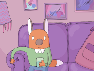
Stills From Final Animation


Artist Bio + Image


''
Molly Lester is a Leeds based animator, illustrator and cartoonist specialising in character design and visual storytelling. 

Working digitally with animation she’s also created a number of hand made zines and comics. Inspired by strong female characters, pastel colours, birds and left wing politics.Taking inspiration from political and social issues, her work focuses on positivity and promotes awareness of LGBTQ+ and diversity.

Molly has recently graduated from BA(hons) Animation at Leeds college of Art and has started working as a freelance creative. She hopes to continue working on independent projects such as animations and comics, both collaboratively and independently.''

100 word Artist Bio as part of the press pack.

Wednesday, 10 May 2017

Post Production/// Art book RE-DO

When I first did the Artbook for this project, I wasn't happy about it all at. The outcome was rushed and honestly missing so much information I was a little shameful of even showing it anymore - but hey, I knew it wasn't the final project. Here are some of the pages from the original 'concept/development book' I created below. I've chosen these pages to document how rough done they were the first time around.

Very roughly done text

Again, very rough and badly scanned in concept art
I decided to completely re-do the art book to a quality I thought would be far more suited to the film I've created. I'm also planning on printing small zines of this art booklet to promote the film whilst I'm selling my other zines at comic fairs and festivals. I'd also like to give people who helped bring my film to life a copy.  I hope you enjoy it! I'm very proud of it and hugely glad I had the time to re-make it.


Post Production/// Uploading and Social Media

I mentioned in my previous Blog post that I've been keeping updates on my Instagram, under a hashtag for the film '#afoxwantstoplayguitar' however I've been slightly neglecting my other social media pages. Such as my Tumblr and Twitter and even Facebook. But Tonight, I uploaded the film and posted it all over my social medias, some with the poster from the film and others with a link to the film on Vimeo. This was all to promote the film, I've worked so hard and I want as many people to see it as possible. I'd love feedback, but likes are wonderful on their own.

Film on my Vimeo

With my Tumblr and Twitter, I uploaded more to 'document' the work I was doing rather than gain any more attraction - despite having a good number of followers in Tumblr.
Twitter Update
Tumblr Update

With Facebook, I want to develop my presence more and promote my work more than I already do. So took to Facebook with hopes of keeping in touch with my followers on there. I was most excited to upload the poster with a link to the vimeo upload to my Instagram, because previously I'd received a number of messages from followers asking when the film would be up/wishing me luck about completion. With Instagram you can't link within a post, so I included the link on my profile and directed people in that posts description to 'the link in the profile'. I also didn't want to crop the poster at all, so instead went back into Photoshop with it and made the image square, with white sides either side of the illustration - so I wouldn't have to crop the poster at all and could still upload the whole thing.

Update on Facebook (Also pinned to top of Facebook page)
Instagram post including direction to the link to the Vimeo Upload of the film

Post-Production/// Teasers and Trailers

Previously I'd uploaded a 'teaser like' video to my Instagram without really thinking about promoting the film, but rather continuing to promote myself and my work however it did get a bit of attention and attraction towards the coming project. I also uploaded WIP videos in order to promote my youtube page, hopefully attracting new veiwers that would later come to see the finished film. I attempted to promote the film on it's own Tumblr page, but got little to no attention so maintained 'teasers' on my Instagram and Tumblr with doodles, WIPs and teasers.

Screenshot of video uploaded to my Instagram page 3 weeks ago

I gave it a shot animating a trailer sort of teaser, however my social media presence isn't very good on Youtube or Vimeo. I decided to focus on creating teasers for my Instagram and Tumblr, knowing very well short videos and animated GIFS did VERY well on those sites instead of full video clips. I also felt like I hadn't generated enough attention on Video sights for people to seek out a trailer of it first, which is what I noticed about trailers on Youtube. Big studios like Pixar or Marvel studios already have millions and millions of fans waiting on ANYTHING they bring out, so leap into a frenzy about a new trailer for anything they're making. However, I have no veiwers on these sights and there for it's best for me to promote this film on sites I already have attention on. I've already already been keeping updates on my instagram under it's own hashtag. #afoxwantstoplayguitar! It's really wonderful looking back at the updates, even if there's only 14. However those 14 have got me a lot of attention from followers, even new followers.


Here's the trailer I made anyways, it isn't finished because like I mentioned before I didn't think it was the most effective way of promoting the film. What's missing is the title and the release date - which would of been animating into the black section at the end of the video.


I know Instagram has it's videos looping, so selected a segment of the soundtrack that looped easily. I also selected shots from the film that loop well, contracting in colour yet moving together well as a whole. I also attempted to get across the rough plot of the film, the repetitiveness of the main characters current life. Here's the teaser as a video as well as a screenshot and link to it on my Instagram Page. 


Screenshot of tease on my Instagram 


Post-Production/// Poster development

Going back to illustration within the hour of finishing an animation entirely is wonderful, animation is stressful but hugely enjoyable - I personally find it stressful because every frame finished means the next needs to be drawn now. Approaching a character I'd got to know so well over creating 3 minutes of animation and grown to love in something that wasn't animation. Illustrating the same character was a nice way to relax after finishing a film, still working but almost giving myself a treat after drawing 100's of frames. However, I still didn't know what to do for a poster.

I took a look online, looking at popular and famous posters on Google and selected a few of my personal favorites. I took huge inspiration by drawing out a few posters with the characters from my film, I've saved my most treasured ones.
Despite really really really REALLY wanting to do the EVANGELION poster seriously and submitting that, I didn't want to take my personal approach. I wanted to be professional with the cartoon I'd spent months on and I wanted to create something that reflected on the film and promoted it in a positive light that featured elements from the film without showing it all.  I started drawing up a rough sketch on Photoshop and really started liking it so continued working on, until I'd already drawn the line art and colour.
Line Art
Flat Colour


Over all I really love the poster, I even printed off a copy for myself to display at my studio. I feel like it reflects Benjamin's character well without being over loaded with elements from the film. It's polight and charming.

Finished Poster A3

Edit: I forgot to add the universtiy's logo so had to go back and render out a version with the logo.

Leeds college of Art LOGO

Development // Look back at Research and Influences Part 2

Political And Social


A huge part of my influence on this project is historical events, such as the 1960's Civil Rights Moment as well as the Homophile equal right moment, including the stonewall riots. As part of my CoP essay studies, I looked into the representation and equal rights movement for trans women including the stereotyping of trans women. I wanted to move towards equal rights and positive representation from the begining of this project, because of my previous studies in that essay.

I became particularly interested in movements that took a stereotype and used it as a positive or in a sarcastic manner. Such as the 'Slutwalk' and the adaptation of the term 'Queer' in the LGBTQ+ movement as an umbrella term. Both examples have been seen as positives as well as negatives. The 'Slutwalk' promotes awareness about sexual assault and rape towards women, promoting that a woman never deserves to be sexually abused because of the way she is dressed - hence the theme of 'slut'. The protestors dress in provocative, revealing clothes as a statement that they're still not deserving of sexual violence - challenging the stereotype of a 'woman asking for it'. In cases of sexual abuse, countless times victims have been blamed for the attack because of what they were wearing, 'asking for it' because of their choosing in wearing such revealing clothing.Supports of the protesting however disregard the movement, as they claim it teaches others that the term 'slut' is an acceptance term to use for any woman. The same applies to the LGBTQ+ movement and the term 'queer'. Once a hateful term, members of LGBTQ+ argue that the use of the term only shows support for others to use the once abusive word, in order to stereotype further.

Cinematic depictions of POC have in previous years relied on stereotyping. The stereotype of a black woman is often aggressive, loud, sassy and/or physically violent  and the same depiction often is the same for black men, however black men in cinema are often put into roles of criminals or aggressive characters. 'Moonlight' recently won the best film at the Oscars2017; the film focuses on a black gay character, who is shown at three stages of his life coming to terms and realising his sexuality as well as repressing it, in order to maintain what he is told to be what a man is meant to be. Moonlights characters are diverse and individuals, not stenotypes; male character cry, female characters are strong and independent and both genders show a level of vulnerability despite physical appearances. The film pushes a comment forward onto the pressure on young boys to become a stereotype of man and the harmful binary attitude we have towards them and what impact that can have on them as individuals. I loved this film, particularly it's depiction of sexuality of someone from childhood to adulthood. The main characters sexuality confuses him, making him uncomfortable around other boys and uncomfortable within himself; there's also a mention of him being called a faggot, where the main character has to ask what the word means because he's so unaware at that point. The main character isn't 'revealed' to be homosexual through a sudden sexual encounter with another man, like many films involving homosexuality tend to depict (such as Broke Back Mountain) - The main character homosexual as a child all the way to adulthood because that's what sexuality is, someone's identity and this character identity doesn't change because of his 'awareness' of it. The character grows up in a setting where he's constantly being challenged to be more masculine, as a result he represses his sexuality into adult hood in order to active 'manly-ness'.  Moonlight makes a clear statement about LGBTQ+ rights as well as the hugely negative impact forced gender roles can have on children all the way into their adulthood. Moonlight challenges stenotypes, as a film that depicts black characters as emotional, independent and individuals as well as within itself as a story.

An influence on me developing this project was the idea of promotion of acceptance towards younger audiences, that cartoons are increasingly featuring more in children's animation (Steven Universe, Amazing World Of Gumball, Star Against The Forces Of Evil... ect). I wanted to create a film that showed younger audiences that being open about your identity and your individuality doesn't stop you achieving your goals and should never stop you, teaching at a younger age to recognise inequality they may face in the future.


Post-Production// Cleaning things up and planning out

Sitting now with a cup of tea, soft lighting and a pair of comfy slippers, I'm going through my laptop finally cleaning up the multiple Photoshop files I created in order to animate this project as quick as possible (which means a lot of random naming and weirdly placed files). So far I've deleted 74 pointless files I created in a panic in order to fill empty frames, which are all massive in their own right. I also created 54 files with individual or 'similar' shots, that I kept as a 'back up'. When I finished a scene I'd render out a video file, so in the end rendering on After Effects wouldn't be so long.  And despite having all this blogging to catch up on and everything else, I was very calm. Mostly because my laptop was finally free of clutter, seriously it got ridicules. If I've learnt anything from this project it's to give things appropriate names and that includes layers within those appropriately named files. And to also keep them in one file and not just all over my desktop, with I guess is a file, but at the same time not.

Now I can focus on promotion. I'm planning on submitting this film into festivals, mostly North England ones because I've seen a lot of them floating around asking for submissions as well as a few European ones. As part of the brief I have to create some sort of pack. Which includes a break down of the project, a over view of the plot of the film, a trailer/teaser of under a minute, 4 stills from the film and an artist ID sort of thing and a poster. On top of that I want to re-visit working with the art booklet again, because my first attempt wasn't very good at all. Although I haven't attended many festivals like manchester animation festival (besides going for one panel) I did work at Thought Bubble this year and as such I was aware of the production behind advertising and documenting the artists/things happening and getting up close n' personal with the leaflets and booklets. I feel like I learnt a lot at working that one weekend, not only with socialising with creatives in my field but also promoting myself/my work.

Things I have to do

  • Poster for film, including 'tag line'
  • Teasers 
  • Self AD
  • Crit, 1000 words
  • Defining of film, 250 words
  • 4 stills from the film
I really love making 'press packs' because I honestly feel like it's preparing me for engaging with other artists through festivals. 

Production// Rendering and reflection

Today was the day. I stayed up all night, working on the animation. My arm hurt. My eyes hurt. But my heart was throbbing with anticipation of seeing my film breath on it's on (finishing the animation).

I slept at 5am, waiting for my university to open up it's doors and allow me to enter it in order to render out a final version of the film (because I don't have after effects on my own computer). However waking up, I realised I hadn't rendered out the audio. That morning I worked on little details of the film, as James worked his socks off.

An hour before my university closed shop, we reached the studio. Hurrying to put everything together and create the credits - I FINALLY MANAGED TO RENDER OUT THE FILM. For the credits on the spot I used the text option in After Effects to credit others who worked on the show, using an orange. Orange like a fox. And as I sat there, waiting for the render complete sound that After Effects has been giving my ears for the past 3 years. I thought about the last 3 years. I started using After Effects after not using anything digitally at all in my work, after a few lessons in my first year. At the same time I started using Photoshop and after this project I've become much more comfortable using the software with my own work. I really want to focus on using After Effects more in the future, especially since I'm planning on expanding on my freelance stuff next year. After that blessed sound happened, I anxious watched it over with James and I was finally happy. Despite set backs, losing a month of work because of health issues and general 'third year stress' I managed to reach the deadline for the most ambitious film I've made to date and what James brought to the project as Sound Designer just made the whole film come together.

Noticeable things I'd change but can't right now:

  • Repeating of a 4 frames of motion half way into the animation, instead of a 'still' character.
  • Lip movement off in some frames of scene 2.
  • Highlight in the final few shots, planning on making them more neon in the future.
  • Some edges of characters are missing little segments of colour.
I'm planning on going back and perfecting these issues before submitting the film to anything, like if I ever submitted it to a festival. James also pointed out he wasn't 100% happy with some of the sound effects/balancing. So both of us will continue working the film in order to reach deadlines for submitting this film to festivals.

Production// From animator to sound designer, using REAPER video tool

REAPER is a free to download software which is 'pay as you feel', you can find the software download here http://www.reaper.fm/. The software is much like other music editing software but this one is cheap, until you want to pay. So it's nice to know we're not acting illegally here.

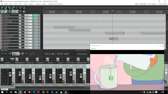
After James balanced out the vocals, sound effects and soundtracks we were struggling to balancing out the audio with the visuals. Luckily REAPER offers a plugin to play videos, so after finding a download online. The whole thing, looking over James shoulder, seemed a lot like the timeline option in Photoshop - as in it's placement was within the 'windows' option.

Screenshot of software/video display
We ended up finding about the video plug in with a forum online, from 2007. 10 years ago. wow, 10 years ago. This software really is good for being 'free'. Because I was very behind schedule the balancing of audio was delayed also, I ended up using the animatic and sending that to James for him to balance out the audio to. In the end, way before the audio needed rendering out and balancing I finished the animation visually. The video tool thing in REAPER was way more helpful synching up audio with lip animation than my screen playing at the same time James was working on audio on his own.

Producton// Sound Track for the film

I approached Devoted Friend about writing and recording the sound track for the film, being honestly that I couldn't afford to pay them and wanted to collaborate - which is something I still feel bad about, as I believe artists being paid an honest wage. They happily accepted, which I was very thankful for.

We met up, had a cup of tea and a few crisps and started talking about what sort of sounds I wanted. At first we really struggled, as I quickly realised I can't describe verbally as well as I can draw what I'm thinking. I hopped onto my laptop and quickly pulled up a few examples of soundtracks I loved the sound of, one of which was the 1974 Bagpuss theme song. The sound itself is very 'vintage' because of the limitations of recording technology at that time and I really loved that. I also loved the friendly-ness to the theme and the familiarity it carries, even for a first listener. I also found the HER soundtrack, which is something written and recorded so tenderly that it's wonderfully memorable. 

We decided on segmenting soundtracks over the animatic, for them to better understand how long certain tracks needed. I did this by simply putting coloured dots over the animatic in different shades, to identity with it's corresponding track then handing the animatic over to them to work with. At first I really loved the idea of the sound track just being a simple guitar, however quickly realised it wouldn't make the impact of the character playing acoustic guitar for the first time in the film - if the whole soundtrack sounded that way. Also they convinced me with a drum machine and a few angry/wonderful guitar pedals. I wanted a 'swelling' lovely sound to be accosted with the main character feeling hopeful or at home and made that quite clear from the begining of my workings with Devoted friend. So the first thing we settled on was what to make that sound with. After settling on a familiar sound, we moved onto working that sound into different soundtracks - some more obvious and others more hidden, or warped. 

All together there are 3 soundtracks recorded, the final being a re-worked slowed down version of the 2nd which is the montage sequence. I personally love the montage one and the drum machine beat to it. Before Devoted friend ‘proved me wrong’ about me thinking a drum machine didn’t belong in this sort of film, I was very nervous about hearing the finished track- however now that I have, I love it. I learnt a lot about the sort of work that goes into a finished sound track, both from a musicians and clients perspective. Also I’d never worked as a ‘client’ below and found the whole thing difficult at first. I wasn’t used to telling someone else what I wanted, I was just used to doing it myself over and over until I got it right.


Balancing out the soundtrack and sound effects will be out next challenge, doing it again in reaper then rendering the balanced audio and visuals in after effects. 

For the final soundtrack to be uploaded onto Devoted Friends Bandcamp page, I re-sized an illustration of the main character to use - in order to promote the film along side the soundtrack as it's own stand alone art piece.

Small illustration

Production// Sound design

James Grimshaw worked with me on this project to develop the sound for this film. He'd recently downloaded REAPER which is a 'pay as you feel' music recording and editing software, similar to Pro Tools. Try Reaper here, http://www.reaper.fm/. It’s a wonderful piece of software and deserves more attention. The only issue we’ve had with it is finding out how to display video, which is fixed with a simple downloadable pluggin. 

After recording the dialogue of each character, we worked on making the quality of each as realistic as possible - but not so much as if you were standing right next to them. We focused on giving ‘room’ to the dialogue for instance if a character spoke in an empty room their voice echoed or if a character spoke away from another, their voice would be slightly muffled but still good quality. James is a self taught musician and was able to explain the software to me quite easily, I over saw the work he was doing on the dialogue however largely left him to editing. 

We used freesound.com to find high quality sound effects for certain effects for the film, however some were recorded just like characters voices were - in a Hyde Park basement. We found sound effects ranging from the weird to the very long and honestly too big to download considering we needed a tiny bit of a second of it. But we found some that worked great. James also created ‘tention’ sound effects with his own hands, using a guitar and a few guitar pedals - an example of this can be seen at the end of the first scene, where the characters anxiety grows as he has the door shut on him.

We did find that two of the recording sessions I’d done were very bad quality - one for Clovers character and the other for Harrys. With Clover the voice actor was very nervous and couldn’t help moving around a lot when delivering her lines, it took awhile for her to get comfortable enough to speak clearly and the final recording came out very quiet. With Harry his voice actor was also nervous but this time rushed and his final recordings came out quite flat. Luckily James was able to cover up the bad quality of the recording of Clovers character with ‘inside of a bus’ sound effects so her voice was still as loud as Bens but the bad quality of it wasn’t as noticeable under the bus sounds.


I also took a look back at classic cartoons to get inspiration for the sort of sound effects I wanted. I looked back at Loony Toons and a few vintage Disney animations. I thought the sound effects of each were effective however thought using similar would seem very out of place, back the aesthetic of my film isn't as 'cartoony' as these shows. 

Friday, 5 May 2017

Production// Lighting and Shadow, multiple layers

As I mentioned in my last blog post, I've been using layers in photoshop to my full advantage in order to active the 'hand drawn' visual aesthetic I want. I wanted to make another post documenting how I've added 'lighting' and 'shadow' to the scenes I've been working with in photoshop with photoshop layers. I wanted to create lighting and shadow effects in photoshop to begin with and avoid using lighting effects in After Effects because I'm far more interested in hand done details than digital, despite it saving a lot of time doing it in After Effects.

Scene 2, 1 and 2

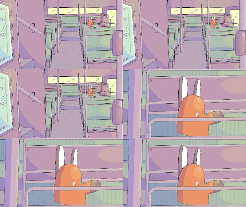
Here's the GIF version of the first two shots of scene 2, showing the main character on a bus. To get across the time of day and the motion of being on a bus. I achieved this effect by key framing the shadow/highlight/sunshine layers opacities. I used this effect in most of Scene 3 with takes place on the same bus.

Here's a scene shot of the keyframes for the shadow/sunshine of the shot. 

First off I keyframes to fade in and out at the same time, however looking back at it if light fades shadows increase. So as the sunshine layer fades the shadow layer becomes stronger and the two work together to create lighting. I really enjoy using this effect, as it works brilliantly with the wiggly line animation I enjoy to create.

Production// Animation START!

I started animating the project at the begining of April. I originally planned on begining half way into February but had to hold it off because of a bit of a negative patch I was going through. SO as I began work I was aware I was behind schedule by a few weeks. I began before cutting down the animatic, making it shorter without losing too much to the project because of time limitations.

The previous two years I've been in a work relationship with Photoshop on my laptop and so decided to continue using the software to animate this project. Previously I've been using Photoshop timeline, separated into different grouped layers to animate a scene. 

And here are the words. Layer order: Animated character, objects in room, background. For an actual example here's a scene I animated with loads of layers involved...

Layers used for a two second scene

Background texture used for backgrounds wallpaper

When I first started animating with Photoshop I didn't struggle with the 'layer' problem that seems to confuse many - as i've noticed when teaching others after photoshop in the past. I had already worked traditionally with animation, using acetate sheets of different characters, colours, shadows and backgrounds. So using layers in photoshop (to animate) was just the same as what I'd already been doing, but digitally.

For a scene later on in the animation I rendered out each 'step' of the animation progress to finish off the shot. The scene involved two characters interacting at a bus stop. The narrative was freshly recorded that morning and because of this is very quiet. So please, headphones are advised.


Here's another progress reel of a shot. I wanted to include this shot because it's an example of how I used layers to my advantage when animating. When the character enters the room, the layer he's animating on is behind the doors layer. However into the animation, he's then animated on a layer above the doors layer - to give the character the illusion of entering the environment. I used this 'trick' a lot in this project, particularly with characters in their surroundings or sat on things.