Tuesday 24 March 2015

Applied Animation// Animation Testing

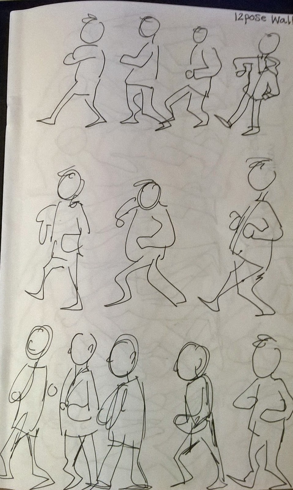
For this project I'm focusing using the computer to animate, so most of the work I create will be my first time doing anything like it. I want to do as many tests as I can in the time I've got... Here is the first version of a segment I'm animating. I'm using layers in photoshop in which I manipulate in After Effects using keyframes (position, scale and opacity) to move them across the screen. This first version was just a test to later adapt, I'm using this version as more of a reference then anything. 

This next version I've cleaned up the animation by redrawing certain segments of the comparison - such as the character in the foreground. Despite this version achieving the look I want for this project (a sort of graphic look) I feel like it's still missing something. 

This final version is the version I will use for the overall animation. 

This version also contains the 'twin' section of this segment that depicts the other main character. I wanted this segment to reflect the characters not only in colour but in personality. I tried to emphasize how 'Lucy' is quite a dark mysterious character and 'Emma' is far more cheerful and innocent when it comes to situations - with the colour schemes of each character's segment. The movement within the segment is the same as version two that I tested, however I added in an 'Opacity keyframe' that slowly fades Lucy in and introduces her slowly into the viewers sights. 


Thursday 19 March 2015

Colour Theory

I attended two lectures that I didn't quite understand about colour theory, unlike my past studies in colour theory we weren't really educated on the emotion/mental connection between us and colour...
Colour is a visual illusion brought on by light waves, theses light waves flood into our eyes and translate to colour based on the power of that wave length. We base this knowledge on what we can see as humans, however different species cannot see a large range of colour like we can; For example it is believed that dogs see in black and white, because theses animals can also see in the dark. Colours can also effect us, sometimes physically and sometimes mentally. Some colours paired together or used in a certain way can produce an obstacle illusion or visual illusions a few moments after the image has disappeared. Colour can also effect emotion and how someone feels, soft colours of golds and greens, sometimes blue can calm and sooth a person. But red, orange can encourage someone into action or aggression. Certain colour patterns can also be related to presenting certain things, such as red is seen as some what violent and pink is often associated with being feminine. We also lightly dusted over what colours work 'well' together. 

Visual Language ///evaluation

I really enjoyed this module, I feel like the projects we've been doing have also improved my studies within animation, that I have been doing along side visual language. For instance, in a past project I was inspired to simplify my character design after being encouraged to be more 'free flow' with my drawings.   I choice 'bug' for the drawing task; I love concept art so I had no problem doing loads of drawings based on one word. I feel like my short 'comic' for a short visual narrative was successful, comments back from my fellow students saying they really liked how cute it was. For the new places drawings I really struggled, because I've really been EVERYWHERE in leeds. But luckily we had a christmas break and luckily I went down to Lincolnshire on the train so I plenty of new places to see! (mostly train stations..) I also visited a place close to my village back home, Brimham Rocks. Which is a place I've never drawn before and I'm willing to take someone to court to prove I have never drawn there. The last place I choice I did so in a rush, because it was my friends flat. I wish I used a wider range of materials on this project, but I did enjoy using markers. The sound project I really struggled with because I'm not really that obsessed with music to begin with, but in the end I was satisfied with my five animations. For the turn around, I was nervous about showing it. I felt it was too 'cartoony' and I should of drawn it hyper-realistic; but i was reassured that as long as I maintain the style within the animation it doesn't matter what 'style' it was in. The last and final project was practically life drawing, working in small groups we drew each other taking it in turns to model. I love life drawing and drawing in general so this project was a lot of fun for me! But again, looking back at the project I wished I used a wider range of materials.

Over all, Visual Language was very beneficial for my studies as a creative. Not only have I been forced to leave my comfort zone to draw backgrounds but I've also been encouraged just to draw which is something I've never been encouraged to do even back when I was studying fine art at college. I found the sound animation tricky but only because I've never ever thought about drawing sound before and the concept of it took a little while for me to grasp. Now I feel like I'd have more thought about the media I want to use in the future, rather then just automatically going for a fine liner.

Tuesday 17 March 2015

Sketchbook// Doodles from life


Sketchbook// 'unnamed' Comic Project


Human form within Animation// Thought of You

Thought of you is an animated piece I was shown late last year when studying 'movement', Although I'm not really a fan of this one. The gestures of movment and structure are lovely, however I wasn't really captivated by this. This animation appears to be rotoscoped in most areas, where the animator has drawn over existing footage - gesturing movement and line. As an animation it works well.

The drawing within this piece aren't very 'loose' but rather defined and gesturing when it breaks down to structure.  The volume of the characters shift between realistic gestures and sort of a symbolic representation, all to do with a break up. Or Atleast, that's what I can work out. 

Human form within Animation// DUET by Glen Keane

An animator that worked within the Disney studios many years past, released an animated short film titled 'DUET' which he animated by hand in 2014. Glen Keane animated this piece by himself by hand, creating beautiful human forms along with wonderful perspective drawings.

The gestures of movement and form within this peace are very effective, considering Glen manages to maintain form to his characters and at the same time have such a wonderful loose feel to his drawings.

Human Form within Animation///The Tale of The Princess Kaguya

The Tale of The Princess Kaguya was released by Studio Ghibli in 2013 and has only recently been shown in UK theaters under an English and Japanese dub.

 I haven't been the full film, however I have seen a short clip online which I absolutely adored. I'm a huge an of hand drawn animation to begin with, but this movie looks so lovely. A little too 'messy' for some but I like the sort of 'sketchy' look to the animation. Especially with the characters moving so fluidly and naturally. The line work reminds me of quick life drawning sketches I've done in past, where movement has been suggested rather then only focusing on a 'natural outline'.  I also really like the texture the pencil marks have given the animation, really defining what it means to 'draw something to life'.

Turn Around Animation/// 3DS


Life Drawing/// Walking poses


Life drawing/// Push Pull


Life drawing// '20min' poses


Bug// 12 image narrative


Monday 16 March 2015

Applied Animation/// Simplistic Colours

Lucy colour test

Lucy colour 
Colour Pallets of main characters


At the start of the project I focused on a short comic series 'Swans In Space' however changed my focus because I wasn't inspired by the story and found it difficult to work with. But I loved the colours in the comics - I loved how every colour worked with not only that character but the next character and even the surroundings. I've put a lot of thought into character design, especially colour.

Colour theory has always interested me, how certain colours gain a certain reaction physiologically - or we see a certain colour representing something else - Such as pink being associated with being female or perhaps innocent, since it's seen as a childish or girly colour.  I also wanted each characters 'shape' to reflect their personality. Lucy looks very intimidating, because I base her appearance (especially her features) off of a tiger, since the character has a pet tiger in the comics. In a contrast, Emma's design is much more school uniform like, her eyes are bigger and she's often smiling - I really wanted to emphasise her innocent/excitable personality.

Backgrounds I feel need to feature pastels and/or lighter shades. I feel like such colours would help pull together both characters designs and colour pallets.

Life drawing// Sqwach and Stretch