Friday 31 October 2014

Adobe Illustrator // Pen tool

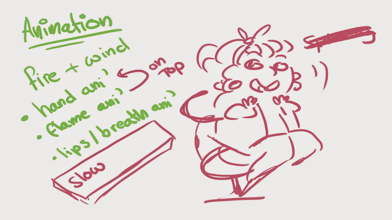
Here are my results when experimenting with the 'pen tool' within the software of 'Illustrator'. I've only really played around with the software before, doodling and scribbling the odd thing; but never learnt all the tips and tricks to the software itself. 

We tested out the tool first on a sort of 'colouring in' paper, a helpful guide to teach us the basics about using the tool. The first few I didn't find too hard to complete. However, the last few I really struggled with; to the point I needed to beg my 'godlike' boyfriend for help.

At first I found the tool extremely confusing and it came across as 'too complicated' to really bother putting up to get the end result; which could of been done easier, quicker (in my option) in photoshop or something similar. But I understand why people use this software.

This software produces work not as a cluster of pixels but as vector. Which means you can resize, stretch and position the image without much trouble or danger of getting that horrible glitchy look.

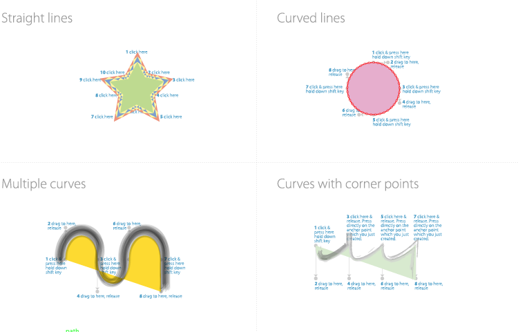
You can also add a lot to this tool, like playing around with the lines. Making them thicker or thinner, or even adding some soft of texture to them. You're also able to mess around with the 'inside' colour and manipulate the original shape or object any way you please.


Over all, it was useless to be introduced to this tool and software. Even if I'll instantly go back to photoshop if I ever want to play around with computer animation or illustrations; it's nice to know there's another option out there.


Sunday 26 October 2014

Pixilation Project //

Pixilation is classed as a stop-motion technique, where the human body is used in the same way puppets or similar are used in animated stop motion sequences. The actor becomes a living mouldable shape, that can be used to act out anything - realistic or otherwise. This technique is often used to blend animation and live action together.

Each frame is captured with a single image - a photo. These photo images are lined up much like how animated frames would be, for our project we were told to use 12 frames per second. Which wouldn't be fast enough it'd speed by and wasn't slow enough it'd look dull.

When I began storyboarding my ideas out I based my project on the theme of 'parent and child'. I know I wanted this project to be more comical then serious and rather silly. I was heavily inspired by my grandmother with the character I played, the parent. And dressed up my friend to semi resemble a child; basically, I forced her to wear blusher and put a silly head band on her. I also begged a friend of mine to capture the photos.

 When filming I didn't expect for us to race threw all the shots as fast as we did. We ended up completing the storyboards on far too few frames. I also didn't expect to get as hot as I did and ended up having to take breaks every few frames. Not only that, I'm pretty sure my friends knees were red raw by the end of filming. Sorry Jemma.

 In the end, after I had transferred all 325 images into the Mac, I began editing them into a video format with 'After Effects'. I struggled. I don't know if it was the software or me, but I find after effects so difficult and pointlessly complicated to use. Also, when editing and saving the video. An unknown error occurred. Where half way into the animation, the frame size would shrink. I had and STILL have no idea why it did that. I also have no idea how to fix this problem and ended up saving the video anyways..


Over all I'm pleased with the end result of this project, considering this was the first time I was introduced to 'live action filming' and Pixilation in general. I would like to revisit this media in the future and perhaps even mix the 'problem' with resizing within the video.

Photoshop Animation

Despite having only been using Photoshop for 3weeks, I felt pretty confident with the idea of animating using the software. The last time I animated in this way, I didn't use 'onion skinning' and hadn't really heard of it before. Onion skinning mimics the traditional ways of animation, in the sense that the layer is part 'transparent' so the layer previous can be seen. Which makes animating using Photoshop a lot more effective and quick. It also lines up the animation into a video file or even a .Gif file.  
 
To begin with,
I tested out this animation software with a basic bouncing ball. Much like how I did when I discovered flipbook animation. However, today we were focusing on elements. I decided to add flames to the ball, so I could play around with how the fire would react to movement, speed and even touching mass.

I'm pleased with how this test animation turned out, in fact I had a lot of fun drawing the frames out and messing around with the flame effect.

Of course, planning out an animation is equally as important as the effect you want to give to your viewers. Next I was told to create a short 3 seconds to 10 seconds animation, based on one or more 'elements'. I scribbled out a rough note or two about how I wanted this element animation to look. And settled on the idea, I wanted to involve both Fire and Wind. 


I wanted to use different layers to my advantage when animating this short sequence. For example the hand is a 'still' image on a different frame and I simply animated the flames atop on a separate layer. I found it tricky to colour each frame, which I also had to do on another layer, because it was a little reparative and troublesome to keep the woman's lip the same shape compared to her skin tone. Flame animation is something I find enjoyable and I'm happy with the final result of how the flame responds to the element of wind. Over all I really enjoyed using Photoshop as an animation tool.


Saturday 18 October 2014

Flipbooks - Animation - part2


After my first experiment with flipbooks, where I animated a simple ball bouncing across the page; I really wanted to test myself further.

However I had no inspiration for what to animate that day... Until my very good, very SICK friend sat beside me; and began to express her discomfort and ill health. So, what sort of friend would I be if I didn't take the opportunity to draw her something? To... Make her feel slightly better. I animated a colourful blue faced girl vomiting. And I must admit I've never proud of this flipbook. So much so I even added colour.

Flipbook Animation - Girls Puke

(20 frames make up this animation, I used highlighters and cheap coloured pencils and a sharpie.)


PHOTOSHOP
After scanning the images one by one into the computer I began editing each one; cleaning up pencil marks, mistakes and even 'attempting' to fix the black ages of the paper. We also had to resize the images and mess around with the resolutions. After that it was just a simple case of lining up the images in photoshop and creating a .Gif of the animation; By using a timeline and crafting a 'timing' for each frame.

I ended up mixing 'computer' animation with my flipbook animation. Really simply by adding a speech bubble that said 'sick'. I only really did this as an experiment to see if I could mix both traditional and computer easily together. All I had to do was draw over the image with a separate layer then merge the two together; then input them into a timeline.


Next I attempted 'computer' animation, using photoshop. I had used photoshop before to draw or doodle but never to animate; so this was completely new to me. But surprisingly I found it easy and quite fun. It was pretty much CEL animation, but using layers. Sure, I had to make each layer slightly transparent but that wasn't too hard to do.  In fact I really loved using photoshop to animate!


Flipbooks - Animation - Part1

My Flip Book animation of bouncing ball

Flipbooks first appeared in 1868 under the name 'kineograph'  
and was the first form of animation that wasn't based on a circler el motion - like the Phenakistoscope. Flipbooks consist of a series of images, each slightly different from the previous and when flicked though quickly; they give the illusion of movement to the viewer.

I've never worked on flipbooks before, but I understood the basic concept of the technique. We were told to first experiment with 'bouncing a ball' across the page, which is a lot harder then it looks. Basing our animation on the principles by Richard William as documented in 'The Animator's Survival Kit'. 
Richard William's reference

I started off at the back of the flipbook to draw out this animation, so once the next blank page was placed over the image I could see the last image faintly - and could make adjustments to the next.

'Squash and Stretch' (rule 1 of Disney's Animation rules) is very important in this animation technique. For the ball to give the illusion of movement, it must spread out slightly across the mass it bounces against when the ball makes contact. It must also 'stretch' to give the illusion of acceleration once it has hit the mass. It's also important to remember the first bounce must be higher  then the second and even the last. To really give the impression the ball has weight.

 My animation of a bouncing ball is slightly off, because.. 
  1. The high the ball drops is far too high.
  2. The first bounce shouldn't give that much of an impact or an angle.
  3. The arc of the over all animation doesn't seem very natural.
Knowing all this and learning from my first experiment with Flipbooks; I'll know where to improve my work with this media for the future.


 so, yeah.


Thursday 9 October 2014

The Lion And The Unicorn -Storyboarding Nursery Rhymes part 3


After looking over my 'finished' storyboards I noticed in certain frames it was hard to really tell what was going on with just lines. So I've decided I'm going to add colour to the storyboards tomorrow to really bring out each frame and what is happening within them.
 
 However, that involves a certain level of character design. I didn't really think about the colour scheme of these two characters when I drafted up the original storyboards.. But I knew I wanted both characters to match each other and at the same time to have opposite colour scheme; so after glancing over the 'colour wheel' I noticed Yellow was opposite to blue and purple. I based each characters colour design in relative to their opposition in the story, since they're beating each other up!
 
Concept Art Of 'LION'
I wanted 'Lion' to be chubby and butch, so avoided using soft shades and instead focused on harsh dominating colours.


Concept Art Of 'UNICORN'

With 'Unicorn' I wanted him to be skinny and tall. I also wanted him to look glamorous and possibly vain; So i focused on using soft shades and making sure his hair always looked perfectly shiny.

Tuesday 7 October 2014

The Lion And The Unicorn -Storyboarding Nursery Rhymes part 2


Today my class and I continued the storyboarding process; By taking the post-it note scribbles we produced yesterday and drawing them out onto layout paper. This is how the final attempts turned out...
---
---
---
I'm really happy with how I managed to replicate how I first imagined the story, down onto paper. Especially considering this was the first time I had ever sat down and plotted out story boards. I'll admit I found it difficult to draw out an accurate representation of what I wanted a frame to look like, however it was so fun to do! Seriously, I had so much fun sketching out these frames. I can't wait to revisit them in the future, perhaps even add some colour later on...


Monday 6 October 2014

The Lion And The Unicorn -Storyboarding Nursery Rhymes part 1

Today my class and I were asked to create between 12 to 18 simple storyboards on post-it notes. I've never really sat down and planned out story boards before, so this was all new to me. But instead of randomly sitting in silence, praying that inspiration for a story of such would be blessed upon me by the heavens; we were next told our storyboards must tell the story of a nursery rhyme. And of course, I picked the one with the word 'unicorn' involved in the title.

THE LION AND THE UNICORN
Illustrated by Jessie Willcox Smith
''The lion and the unicorn
Were fighting for the crown.
The lion beat the unicorn
All about the town.
Some gave them white bread,
And some gave them brown;
Some gave them plum-cake,
And sent them out of town.''
 
After reading over the Mother Goose poem I couldn't stop myself from laughing. This small rhyme had so much character and the image I had inside my head, about a unicorn and a lion beating each other up with giant neon red boxing gloves - over an angelic crown from the heavens - was too funny NOT to pick and so I instantly started scribbling story boards for this cartoon.
 
First few storyboards I scribbled down

Despite having an idea inside my skull how I wanted this story to look like down on paper; It took longer then expected to get the storyboards to 'flow'. Making sure certain boards weren't repeated anywhere else (for example the characters being 'flat' to the viewer, facing them head on ) and that there was a good overall heartbeat to the comedy of the story. I found myself pausing and thinking about how I wanted these characters to be positioned and how that would look to the viewer. And if I wanted it to look this way or that way and so on... But I have to admit, I had way too much fun drawing a lion and unicorn beat each other up!

Comments from other students on storyboards

I got plenty of feedback about how I could improve my storyboards and what they liked best about them, from fellow students. After it was pointed out to me how every frame seems to be 'flat' and that there was hardly any variation in angles and such in each sketch I began to see areas I'd like to work on more. I can't wait to revisit these storyboards tomorrow and improve them further!

Introduction To Storyboarding

Storyboarding is (in my personal opinion) the most important process of any visual communication. From horror movies to yogurt adverts, the way the scenes and frames are laid out to the viewer, can either make or break how effective it is. Storyboarding is used in a range of media, film, animation and even music videos. Basically, anything involving capturing motion, a story or even a message; involves some form of storyboarding.

Storyboards can be presented with many different medias, such as charcoal or even digital illustrations. Most common of all is the good old pen or pencil and paper. However, even storyboarding takes many different stages, much like the movie itself. The first stages are basic gestures of movement and are scribbled down onto paper. Next comes the more detailed ones, characterising more necessary elements to the scene.  Finally the storyboards are crisp and detailed, able to explain to those working on the project what should be happening on set. And what it should look like, where characters should stand or how they should react. And so on..

What I learnt today is that characters on the scene aren't the only thing that's important. The whole composition of the frame is! Open spaces. Cramped frames. Close ups and wide shots. Even lighting, can give the audience either a very good or very bad vibe to the whole scene; depending on the messages you want to give off. Either way, I can't wait to study the art of storyboarding further. In fact again, I'm so excited about learning more about methods and techniques!